
Harper's Bazaar November 2009
Ph: Karl Lagerfeld


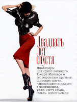
If I'm going to be honest, I feel quite apathetic towards this editorial. I don't think it's horrible, but I don't think it's that great either. It just kind of exists, so I don't really know what to say about it. Freja looks good (although it's pretty hard to make her look bad) but I hate that they've airbrushed her face so that it's nearly unrecognizable in the 5th picture. I think this was shot in Venice, probably at the same time the Chanel Cruise show was going on back in July. (Edit: my bad, it was shot in Monaco. Thanks anonymous commenter!)
The sparse backdrop, singular focus on clothes and use of full designer looks did make me pay more attention to the fashion being highlighted. In fact, I even started to recall other editorials featuring the same or similar looks. (Note: All the following editorial and scanning credits can be found in the image file name.)

Louis Vuitton
I love seeing how the same pieces can end up looking so different from editorial to editorial. Fashion is really about transformation. Models have to transform and so do the clothes. So if you think about it, photographers and stylists are just the manipulators of external factors.

Fendi
I also love doing these comparisons because it puts things into perspective. For example, I think this editorial's shortfalls become more evident when you see it next to others.


Dolce and Gabbana
The setting is incongruous with the concept, which is itself underdeveloped in my opinion. Just because you shoot in Monaco doesn't automatically mean it will be glamorous.

Givenchy
I would almost rather have seen this shot in a studio. At least then all the empty space would make more sense. The setting already looks fake in some shots anyway.

Giorgio Armani
I think Freja is a competent poser, but we all know it's never really been her strong suit. Perhaps I'm just having a Karolin moment, but I really think she puts everyone else to shame.

Marc Jacobs
It's the subtle details like her hands that make me stop in my tracks. Attention to detail like that comes with an innate sense that's really difficult to teach.

Chanel
It's ok Freja. I love you for so many other reasons that more than make up for your posing. Plus I'm sure it was hard to do a good job with Baptiste awkwardly holding you. And really, who wouldn't look just ok compared to this?


Thank you for indulging my Karo obsession. Moving along now...Freja also has an editorial in the October issue of Numero. You can see the full thing here.


Thank you for indulging my Karo obsession. Moving along now...Freja also has an editorial in the October issue of Numero. You can see the full thing here.
Image Credits: My scans, frockwriter, scans by tFS members AngelLover, Diciassette (17), Luxx, achAT, Melange and helligirl.


8 comments:
i love karolin! glad she made her cameo here. she's so underrated!
now if only she was paired with Freja just like sarah awhile back.
^Yay! I'm glad. She's definitely underrated. And I think she's giving Freja a good run for her money in the fierce, androgynous department. I'm dying to see them in an ed together too, but I'm doubtful it will ever happen.
The Bazaar editorial was shot in Monaco. Freja is not really known for some outrageous posings but she usually more than makes up for it through her wealth of facial expressions. Karolin is also a great model but at the moment Freja is the barometer when we talk about androgyny.
Oops, you're right about it being shot in Monaco. Thanks! And I would usually agree with you on the facial expressions. But even those are lacking in this ed. Overall I just found the whole thing uninspired. And when I feel that way, I'm going to express that instead of just blindly praising everything Freja is in. But I definitely do appreciate your opinion!
the whole ed is pretty tame compared to Karo's. it might have something to do with Harper's or it's just the subdued glam, albeit boring, Karl was shooting for.
or i could be biased cuz i'm on a Karo high as of late.
Ohh, I'm not talking about this current ed, it definitely lack the oomph that Freja usually projects, maybe it's because of the photoshopping/airbrushing. I'm just commenting about her very tamed poses in editorials.
I quite like Freja but not the editorial, it is kinda "flat", so to speak. And do we really have to put up with Baptiste G. in all Chanel/Lagerfeld editorials etc. now? Jesus! I'd rather have Laurent Albucher...
I'll be one of the few to praise Freja here, I guess. lol I love the ed. You give the photographer what he wants. I'm assuming if he wanted Freja to emote more, jump in the air or strike a fierce pose, she would have. She's done it in the past.
I get the sense Karl was going for a more serene feel with this ed, like he did with the Chanel campaign ed. I'm a fan of the softer more subtle, almost unassuming, poses and photography instead of the in your face ones. I like it when Freja gets to show her softer side.
Post a Comment