Two stories, two similar surface appeals, two different reactions....
Starting with the good. Vogue Paris + Mikael Jansson + old
French horror story set in the Louvre = me taken totally by surprise
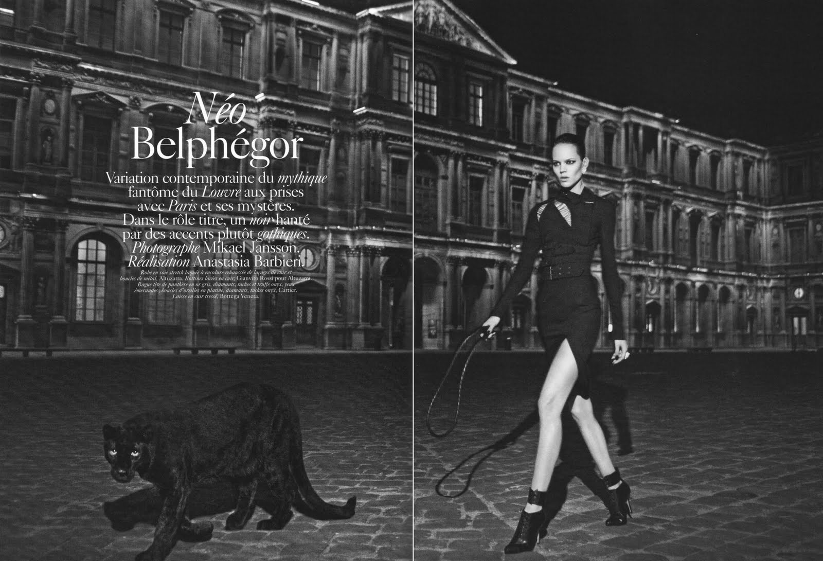
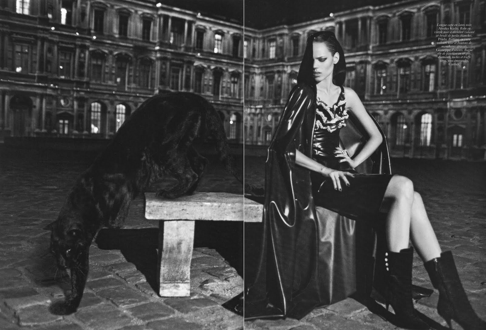
Neo BelphegorVogue Paris September 2010
Ph: Mikael Jansson
Styling: Anastasia Barbieri
Have to admit I wasn't too excited about this editorial when I first saw the preview snaps, but after seeing these images I've completely changed my mind. The patina of these shots are manipulated in just the right way that they add to the overall chill of the story. The dark aura and elements enhance the myth of the story and the feeling of dread you get from the potential threats lurking in the shadows. Freja is sinister, the panther is eerie, and if you look at the images in just the right way under just the right light, you'll get slight shivers up your spine.


Even though I'm already tired of the new model stereotype of Freja as the tough, dark, mysterious, cool girl (although I suppose it's better than being solely the androgynous girl), it plays well in this particular editorial. Freja makes for a great villain, and she's emoting well, especially in the shot where she's sitting down. Yes, the dangerous but glamorous femme fatale role is a bit trite, but when it's done well I don't mind seeing it again.
It's Freja's third time working with Jansson, but we have yet to see color work from the two of them. Luckily Freja has a face with angles and planes perfectly capable of expressing wide range and depth without the aid of the color spectrum. Just take a look at the history of their work together and you'll see (Pop Magazine part
1 and
2,
Interview Magazine). So maybe all the b&w is deliberate...like a careful case study over time. I absolutely can't wait to see this in print, because 99.99% of the time editorials look better when they're in print and
in your hands instead of on your computer screen.
Now another b&w editorial, but with a less positive outcome in my mind.
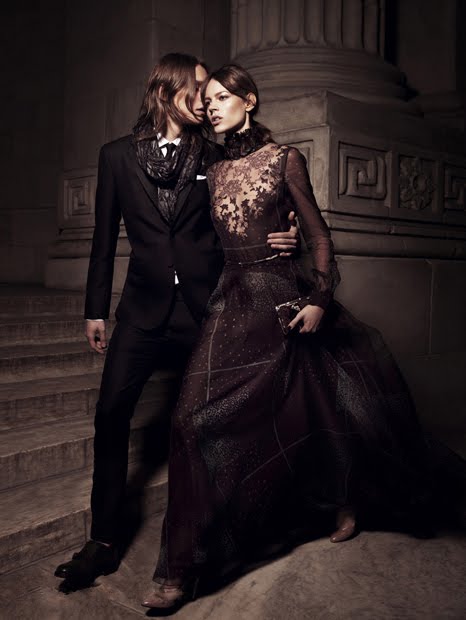
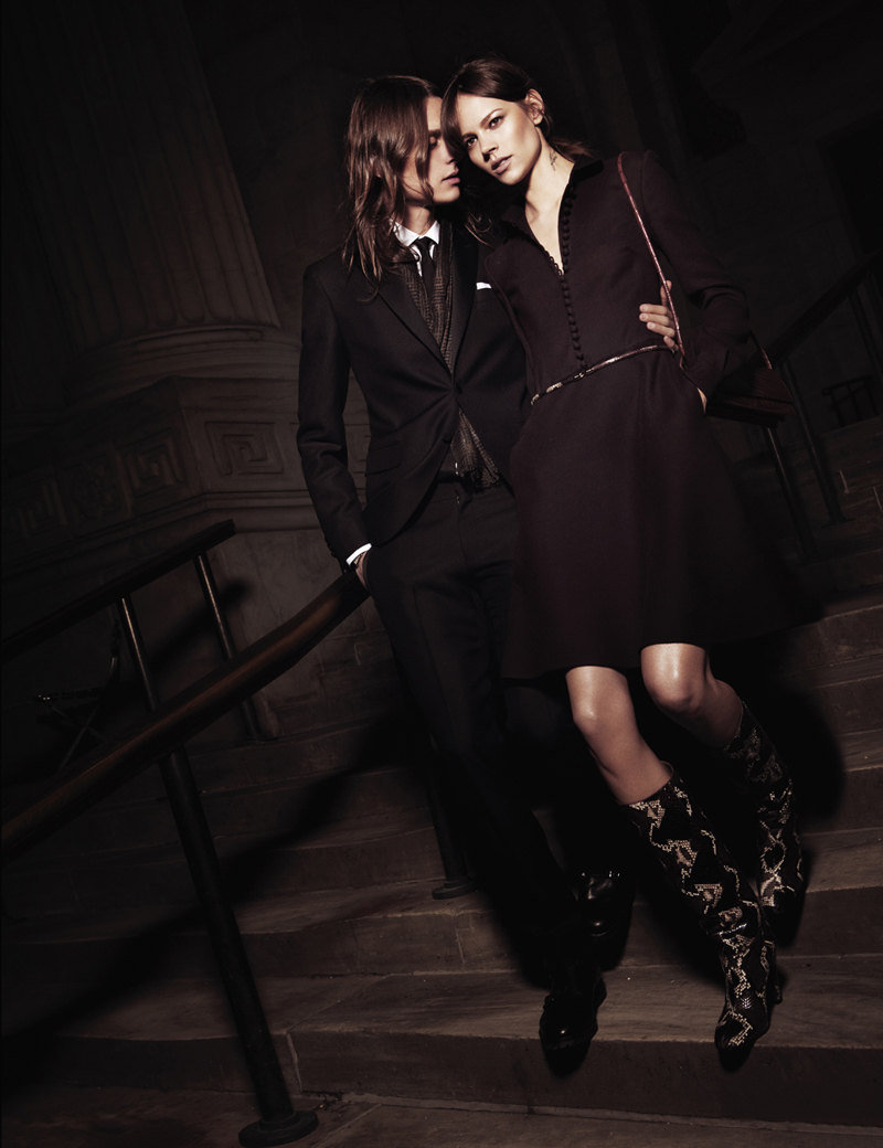
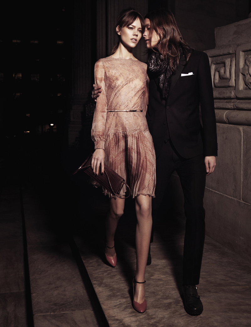
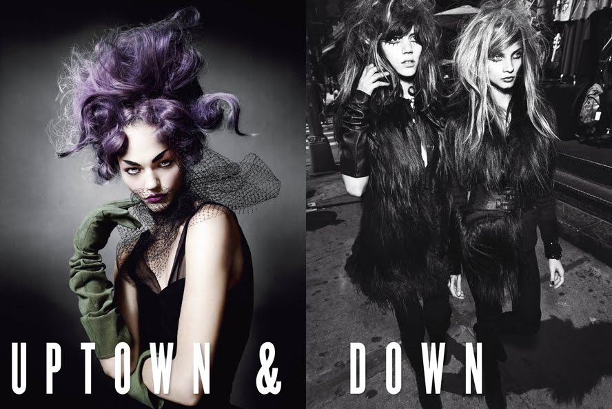
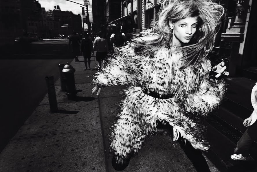
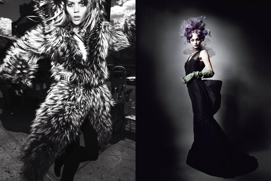
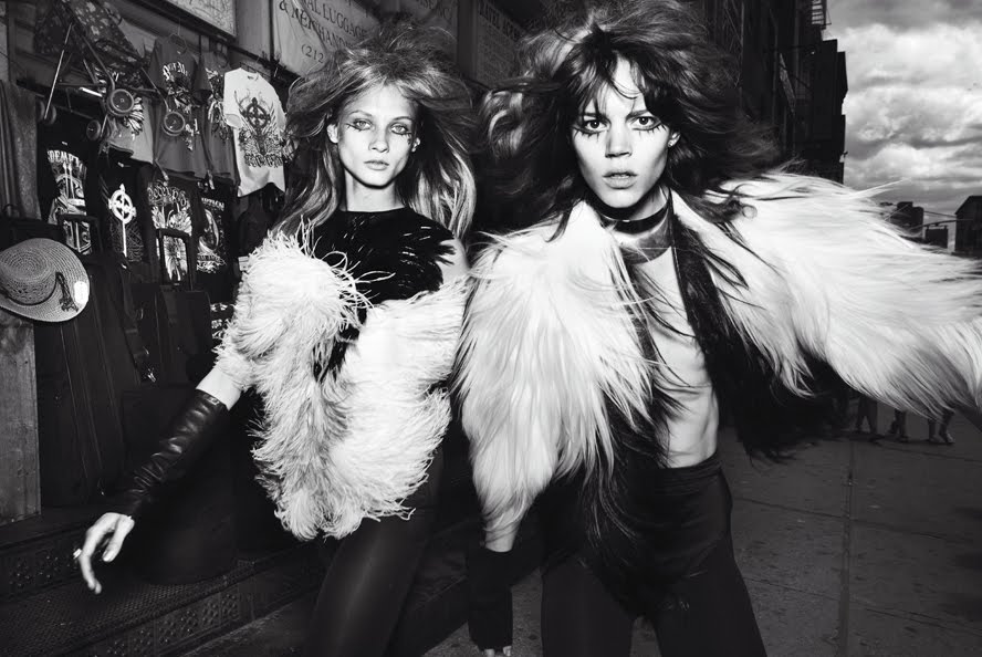
Uptown and DowntownV Magazine #67 September 2010
Ph: Mario Testino
Styling: Sarajane Hoare
Other Models: Anna Selezneva, Carmen Kass, Sasha Pivovarova
Too bad Freja's first collaboration with Testino since
early 2007 had to be this unremarkable story. Not a fan of the deer in headlights look, messy hair, and fur and feathers galore. I much prefer Sasha and Carmen's "uptown" shots, where the studio setting (although usually boring) provides a good contrast to the clothes, hair and makeup. Freja and Anna's "downtown" shots are too busy for me. Too much to look at, too much of it being pushed in my face, too much to distract me. What's the point? What's the purpose? What's the message? Why does Freja look so confused? How many licks does it take to get to the center of a Tootsie Pop? The world may never know....
Freja, I love you and your work, I really do. But I have to wonder....does modeling treat you badly? Are you unhappy with your job? Because why the hell can't we see you smiling and in something happy? If I only had your recent editorials to look at, I'd think the world was approaching its end or something. I know it's not your fault. You're doing the best with what you're given in the parameters you're allowed to work within. But I hope people give you chances to expand beyond and move away from this, just like they finally gave you chances to move away from all the androgyny. Until then, I'll just be happy that you're getting work with a wide range of photographers and people, but too bad you don't look more happy about it. :)
Image Credits: Scans via tFS member Carla-A, vmagazine.com













 Posts
Posts

