Showing posts with label Mario Testino. Show all posts

Monday, April 4, 2011

Three Modern Brides

After a ridiculously quiet April in terms of magazine presence, Freja starts off May with a bang! She has one out of the three covers for Vogue UK's "royal wedding" issue and she shares posing duties for this multi-cover issue with Lara Stone and Natalia Vodianova. This marks Freja's second Vogue UK cover in less than a year.....congrats Freja!

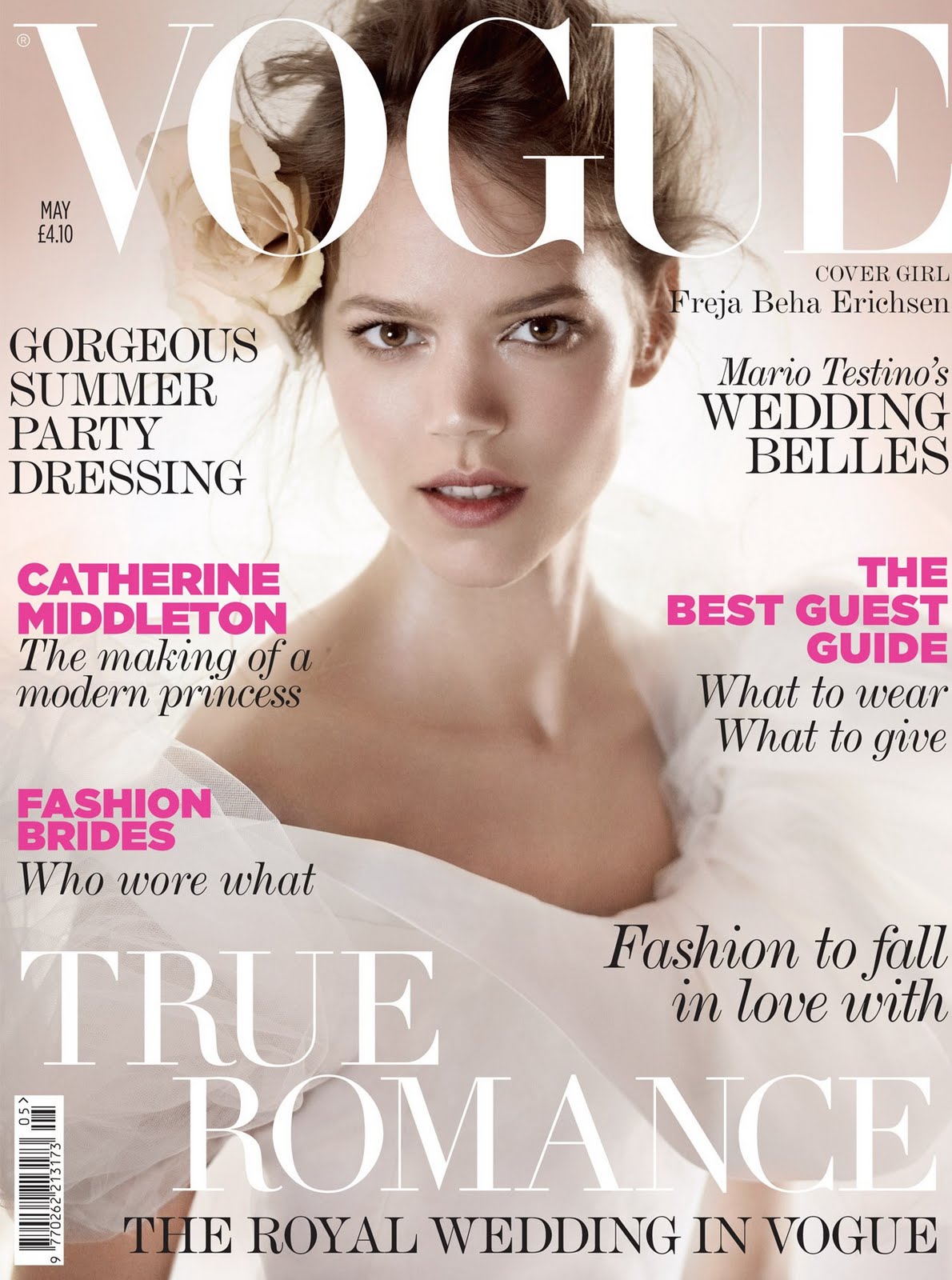
Vogue UK May 2011 Cover
Ph: Mario Testino
Styling: Lucinda Chambers


Mediaweek.co.uk shares the concept of the issue with us:
"The 382-page issue, which hits newsstands on Thursday (7 April), has 152 ad pages – an increase of 40 ad pages compared to last year's issue.

Vogue is offering readers a choice of three covers featuring models Freja Beha Erichsen, Lara Stone, and Natalia Vodianova dressed as brides. The images are shot by Mario Testino.

The issue carries the coverline "Catherine Middleton, the making of a modern princess" and looks back at the magazine's 95-year history of covering royal weddings.

Alexandra Shulman, editor of British Vogue, said: "We spent a great deal of time discussing what our tribute to the marriage of Catherine Middleton and Prince William should be, and we came up with a delicious confection of all things matrimonial, a portfolio of white fashion and a completely indulgent trio of bridal covers with Natalia Vodianova, Lara Stone and Freja as the figureheads for this commemorative issue."

According to latest figures from the Audit Bureau of Circulations, Vogue had an average net circulation of 211,277 for the six months to December 2010, which was up 0.4% year on year."

I make it strong habit not to talk about Freja's personal and private life on this blog. But I do want to very lightly touch on it right now if you'll allow. To have a woman like Freja represent a modern bride, a "figurehead for this commemorative issue" as Alexandra Shulman puts it, is such a wonderful and symbolic occurrence. Even though most of the mainstream public isn't privy to Freja's personal life and preferences, enough people are that having her on the cover of this issue shows a great sign of acknowledgment, progress and acceptance. Modern brides come in all different shapes, sizes, forms and lifestyles. So it's only fitting to have such three different models representing for the "royal wedding" issue, as the new royal couple seem so modern themselves (as far as British royal couples go). I could go on about the significance and meaning of it all, but like I said, I just wanted to lightly touch upon the subject.

Freja has come such a long way in the past year and a half. For a really long time she was pigeonholed and stereotyped into a modeling persona that I didn't really like at all, and I'll admit that it was frustrating to see certain tropes and characters of hers repeat over and over again, while other aspects of her potential were left untapped. But now things have changed drastically and I couldn't be more thrilled. Who would have ever thought Freja would be one of the three models picked to stand for a modern bride on the Vogue UK issue coming out on the eve of the biggest wedding in recent times? It even boggles my mind.

And with Vogue UK circulation up for the year (a year that included Freja's solo cover), it's just more and more good news for Freja, her marketability and her ability to sell. She has really come into her own as a model and a true contemporary icon for this current generation. It is of course too early to tell how indelible her mark will be on the long strands of history, but for the time being we can revel in Freja's successes and what they mean for our modern times, right here and now.

Image Credits: mediaweek.co.uk, vogue.co.uk via tFS memer IAmLordZen

Tuesday, November 2, 2010

Model Stereotypes

Look! It's Daria, Lara, Sasha, Freja and lots of your other favs all in one editorial! Too bad it sounds so wonderful that it's just bound to disappoint. For things in life are never as good as they sound.....or are they?

Star Girls
Vogue UK, December 2010
Ph: Mario Testino
Styling: Lucinda Chambers
Other Models: Angela Lindvall, Carmen Kass, Claudia Schiffer, Daria Werbowy, Edie Campbell, Georgia May Jagger, Karlie Kloss, Kate Moss, Lara Stone, Lily Donaldson, Naomi Campbell, Natalia Vodianova, Sasha Pivovarova, and Stella Tennant

Freja's Part:

I kind of wish all the model were in one breathless group shot a la Annie Leibovitz and those awesome Vanity Fair covers of the early 2000s. I used to love those covers so much. They were so enchanting and fantastical. (Of course, that was also at the height of my Hollywood fascination so maybe that's why they seemed so awesome to me. But in hindsight they're still pretty kick ass. Not like those photoshop-of-horrors Vogue US top model covers.) Anyway, with each girl in this editorial being shot individually, it's difficult not to reduce each model down to some stereotyped version of herself. But short of photoshopping everyone into one picture, individual shots are the only way this concept would have worked. Can you imagine the nightmare it would have been to coordinate the schedules of Naomi and Kate, not to mention all the other models as well!? Eeesh...nightmare almost seems like an understatement.


Anyway, we have Sasha as eccentric fairy queen, Natalia as ballerina, Lara as vamp with boobs, Freja as androgynous rocker, Karlie as American sporty, etc, etc. If you look closely, you'll even find that the stereotypes are exploding out from the text descriptions of each model. Lily is an English Rose? Wow, never, ever heard that one before. As trite as this all is, I suppose it fits the theme of this editorial. They're taking the characteristics that made each girl famous and highlighting them. I assume that Vogue UK is similar to Vogue US in terms of market demographics, so the uninformed masses who know little to nothing about these models can look at their pictures and surmise the role they fulfill within the industry--the very role that made them all "stars." (But don't ask me what Edie Campbell is doing here after completing only half of a runway season. That hardly qualifies as star material.) If you already know everything there is to know about these girls (or if you run blogs or tumblrs on any of them), this editorial will most likely be comme ci, comme ca. I feel like we've all seen these pictures and poses from all these models in some form or another many times before.


Even if I'd rather see all these girls play outside their usual roles, I get it. A magazine like Vogue UK has to walk the fine line between commercial appeal and high fashion credibility. How else are you supposed to introduce these models to a public who possibly knows nothing about them? You have to make them recognizable, that's how. You have to present them in ways that might hit on some flicker of recognition in the viewer's mind. And at the very least, everyone looks pretty good, and it is a nice introduction to star models if you know nothing about them. And of course it's a great honor for Freja to be included. We can't ignore that Vogue UK has been one of her biggest and most constant supporters, even when times weren't so good. I will never forget how excited and relieved I was to finally see Freja show up in a magazine in Before the Fall, after a summer of literally no work back in 2008. Ever since then, I've always had a soft spot for Vogue UK. (On a semi-related note, I think Lucinda Chambers is a Freja fan and part of the reason why she's featured so much in Vogue UK. They've worked on a number of eds together, and Lucinda also styles the Marni show and we all know that Freja is a Marni runway fav.)


There is one thing I absolutely love about this editorial and it's the title page. It's extremely whimsical, interesting and creative. Just looking at it makes me smile. It's such a nice touch, and it elevates the whole editorial by tying everything together. Otherwise, the photos look choppy and unrelated. But with all the autographs on the front page, it feels like a collection of pictures some fan gathered together into a book. Subsequently, this fan was then lucky enough to meet all of his/her favorite models and collect all their autographs. And whenever you or I finally pick up this magazine in real life, we'll kind of have a fan book of our own. I like that thought, and I like the relational and tangible aspect of it. I don't know if it was intentional, but it's a neat way to engage the viewer.

Image Credits: Scans by tFS member gossiping.

Friday, August 27, 2010

Two for One

Two stories, two similar surface appeals, two different reactions....

Starting with the good. Vogue Paris + Mikael Jansson + old French horror story set in the Louvre = me taken totally by surprise

Neo Belphegor
Vogue Paris September 2010
Ph: Mikael Jansson
Styling: Anastasia Barbieri


Have to admit I wasn't too excited about this editorial when I first saw the preview snaps, but after seeing these images I've completely changed my mind. The patina of these shots are manipulated in just the right way that they add to the overall chill of the story. The dark aura and elements enhance the myth of the story and the feeling of dread you get from the potential threats lurking in the shadows. Freja is sinister, the panther is eerie, and if you look at the images in just the right way under just the right light, you'll get slight shivers up your spine.


Even though I'm already tired of the new model stereotype of Freja as the tough, dark, mysterious, cool girl (although I suppose it's better than being solely the androgynous girl), it plays well in this particular editorial. Freja makes for a great villain, and she's emoting well, especially in the shot where she's sitting down. Yes, the dangerous but glamorous femme fatale role is a bit trite, but when it's done well I don't mind seeing it again.


It's Freja's third time working with Jansson, but we have yet to see color work from the two of them. Luckily Freja has a face with angles and planes perfectly capable of expressing wide range and depth without the aid of the color spectrum. Just take a look at the history of their work together and you'll see (Pop Magazine part 1 and 2, Interview Magazine). So maybe all the b&w is deliberate...like a careful case study over time. I absolutely can't wait to see this in print, because 99.99% of the time editorials look better when they're in print and in your hands instead of on your computer screen.

Now another b&w editorial, but with a less positive outcome in my mind.

Uptown and Downtown
V Magazine #67 September 2010
Ph: Mario Testino
Styling: Sarajane Hoare
Other Models: Anna Selezneva, Carmen Kass, Sasha Pivovarova


Too bad Freja's first collaboration with Testino since early 2007 had to be this unremarkable story. Not a fan of the deer in headlights look, messy hair, and fur and feathers galore. I much prefer Sasha and Carmen's "uptown" shots, where the studio setting (although usually boring) provides a good contrast to the clothes, hair and makeup. Freja and Anna's "downtown" shots are too busy for me. Too much to look at, too much of it being pushed in my face, too much to distract me. What's the point? What's the purpose? What's the message? Why does Freja look so confused? How many licks does it take to get to the center of a Tootsie Pop? The world may never know....


Freja, I love you and your work, I really do. But I have to wonder....does modeling treat you badly? Are you unhappy with your job? Because why the hell can't we see you smiling and in something happy? If I only had your recent editorials to look at, I'd think the world was approaching its end or something. I know it's not your fault. You're doing the best with what you're given in the parameters you're allowed to work within. But I hope people give you chances to expand beyond and move away from this, just like they finally gave you chances to move away from all the androgyny. Until then, I'll just be happy that you're getting work with a wide range of photographers and people, but too bad you don't look more happy about it. :)

Image Credits: Scans via tFS member Carla-A, vmagazine.com