Freja Beha, the Rock N Roll Star
i-D Magazine Spring 2010
Ph: Emma Summerton
Styling: Edward Enninful
After seeing Freja's i-D cover, I have to admit that I didn't have high hopes for her editorial inside. Well, I was most definitely pleasantly surprised by the lovely, albeit too short, only-girl story. Just four shots; all of them upper body ones with one profile shot. They're almost like a series of portraits, and that's what I think is so interesting about them. We haven't seen Freja in a story like this, so it's great to see her continually expand her fashion portfolio and her ability to converse with the camera.
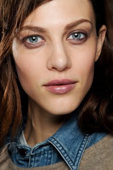
With a story that's set up like this, I really think it's intent is to bring focus to the details of the clothes, rather than the full head-to-toe looks. At least, those details are what stood out to me enough that I ironically ended up wanting to see the runway looks in their entirety anyway. Like, I saw the intricacies in the Louise Golden piece and I just had to see the whole thing for comparison. The details made me appreciate the whole look....and the same can be said for the model.
By focusing on the natural charisma and grace of Freja's face (the details) this editorial makes us appreciate all her abilities as a model (the whole package). Earlier on I asked the question "Androgyny or femininity?" Well, here we have the perfect example of how easily and effortlessly Freja can traveling between both poles. This editorial is a great model profile piece in that it provides the girl with a vehicle by which to display her full skill and range in subtlety and emotion. To be able to carry this off successfully, you have to be a model who's well versed in all facets of human emotion and who's able to convey them with a slight alteration of the mouth here, or a slight arch of the brow there.
With the title bearing Freja's name, it's clear that she's supposed to be the star here and she most certainly delivers even within the limitation of four short pages. I love that she can be strong and dominant, showing us different aspects of her personality here. But she can just as easily be a mere clothes hanger, if the situation calls for it, letting the clothes take focus as was the case in her Vogue UK editorial.
I feel like this is a theme that I continually re-visit: how Freja moves freely about along all these different spectrums. Androgyny/femininity, high fashion/commercial appeal, strong/demure, etc... If I've learned anything from all the time that I spend analyzing and dissecting Freja's career, it's that in order to be a good model-nay a great one-you have to be able to be all things to all people but never lose the essence of your being in the process. It's quite the tall order, but all the tops girls can do it/have done it. Think Raquel. Think Daria. And people believe modeling is easy....well, it doesn't seem so easy to me.
Image Credits: Scans by yala_agni @ Fashion_Screen LiveJournal, style.it, vogue.co.uk
Showing posts with label i-D Magazine. Show all posts
Thursday, April 1, 2010
Identification
Labels:
Analysis,
Androgyny,
Editorial,
Emma Summerton,
Femininity,
i-D Magazine,
Musings
Tuesday, March 23, 2010
Springtime Will Punch You in the Face
At least that's what comes to my mind when I see Freja's latest cover for the Spring 2010 issue of i-D Magazine. Nothing about this says "spring" to me except for the bright green background. Maybe that explains why it seems photoshopped in at the last minute. Quick! How do we make this look more spring-y? I know! Make the background green. Genius.
The cover was shot by Emma Summerton, who is a wonderful photographer. Therefore, I have a hard time believing that this was the best option for a cover shot out of all the images that she took. It doesn't really bear the distinctive and defining characteristics of her usual work. The hair is an overwhelming mop, the angle is distracting (making Freja look even thinner than she already is) and the styling is bland. Freja also looks rather menacing. I just don't believe in this image as a cover hailing the arrival of Spring. i-D covers are usually a complete hit or miss for me though. And compared to the last cover that Freja had, this one's shortcomings become even more obvious to me:
Then again, I'd be a very happy women if the words androgynous and/or boy and Freja never appeared in the same sentence ever again. At the very least I'm thrilled that Freja is working with Emma! Their first and only other collaboration yielded this lovely editorial with Lily. So hopefully the inside story will be a bit more inspired and polished in it's execution and aesthetic. One thing that I do kind of like about this cover is that it seems to capture the essence of who Freja appears to be off the runway. It seems like it could be a candid shot of her backstage during the shows; but ironically enough, that's also a reason why this cover doesn't work for me as a cover. It just seems amateurish. What do you think? Am I just too biased against anything androgynous when it comes to Freja, or do I have some legitimate concerns here?
And good god Freja...when was the last time you took a break from working? The rate at which you're putting out new work is alarmingly fast....not that I'm complaining. But still, I think my wallet and typing fingers could use a rest and I'm sure you could too.
Image Credits: ftape.com via tFS member Flashbang, scan by tfS member Diciassette (17)
Labels:
Cover,
Emma Summerton,
i-D Magazine,
Upcoming Work
Sunday, September 6, 2009
Photography, Politics and Purple
Freja's Purple Magazine editorial is up, thanks to candlebougie at tFS. And depending on your sex, your opinion about the exploitative tendencies of the fashion industry, and your views on sexual politics, you're either going to love it or hate it.
Best of the Season
Purple Magazine FW0910
Ph: Terry Richardson
(note: this is not the complete editorial, only pictures with Freja)
Look, I've taken my share of feminist theory classes but it's not my place to tell you how you should feel about this editorial. You're initial, gut reaction to the images is what you should use to gauge how you feel about Terry Richardson, his work and his "artistic" approach. Not what other people say, not what you think you should feel, not what you think is politically correct, not how you feel about the models.
As much as I want to go off right now, this blog isn't the place for me to pass judgment on Terry, the fashion industry that's embraced his approach, or the agents and models who are permissive and complicit in his image making. As much as I want to, I'm going to refrain and hold my tongue. (And I know that most of you, scratch that, all of you don't want to read a rant about patriarchy, the male gaze, the marginalization of lesbianism, yadda, yadda, yadda.)
However, I do want to do an interesting comparison. On the one hand, you have this editorial above that was photographed by a heterosexual male. On the other hand, you have this editorial below that was photographed by a homosexual female.
Clean Living
i-D Magazine February 2009
Ph: Collier Schorr
It's interesting to note the similar subject matter (in that there is nudity and Freja), yet completely differing end results. In fact, it's striking to me how different the images feel, how different Freja is portrayed, and how different I feel in response. Perhaps the differences are so stark to me because I know about both photographers and their histories. This hits home the point that photography absolutely depends on the gaze behind the lens and the gaze of the consumer as much as, if not more than what is captured within the frame.
There are different narratives and hierarchies behind all photographs that we see, separate from the ones contained within the actual images. They color our perceptions, perhaps without our knowing it. I guess what I'm trying to say is that there is no such thing as objectivity, for nothing exists in a vacuum. This is what makes photography such an interesting medium. It exists under a guise of objectivity because it purports to capture the "real." However, photography is just as constructed and affected as any other medium of art. The fact that it is so entrenched and intertwined with the production of fashion says something...I just don't really know what yet.
The more you know about social issues and politics and the more you experience those things first hand, the harder it will be to divorce certain ideas from your mind when you view these images...any images. So despite any enjoyment I may have from seeing two of my favorite models together in this editorial and seeing Freja's beautiful smile once again, Terry's reputation precedes itself and that's just something I can't overlook right now.
I'd love to hear what you feel and why because other opinions are always appreciated, no matter how different from my own they may be.
Image Credits: fashionista.com, scans by tFS member candlebougie
Subscribe to:
Posts (Atom)