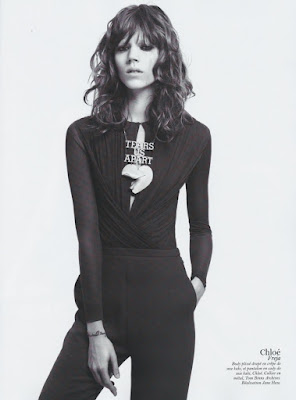
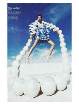
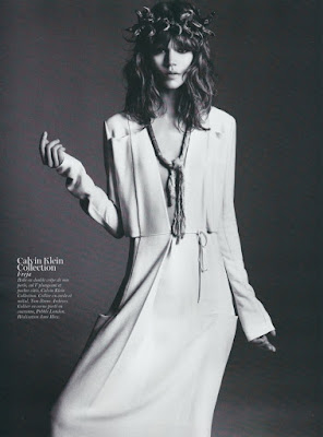
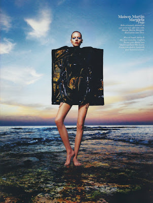
Ever since I've seen the images from Freja's new Vogue Paris editorial, I've had Joy Division's Love Will Tear Us Apart in my head for obvious reasons. And maybe it's fitting that I do, because I can't get the first image and all it's lingering emotions out of my head.
En Vogue l’Été
Vogue Paris February 2011
Ph: Mario Sorrenti
Styling: Jane How
Other Models (not pictured): Daphne Groeneveld, Daria Werbowy, Joan Smalls, Lara Stone, Natasha Poly, Sasha Pivovarova, and Saskia de Brauw
If you can only dwell on one image from this editorial, make sure it's the first one. Make sure you view it in full size and make sure that you give it a good, long look. For if you do, you will be privy to one of the most touching and expressive moments from Freja's work in a long time. Notice the mascara touched trail of a tear down the cheek and the pain in her eyes. The emotion is tangible, but somehow paradoxically made subtle by the necklace's pronouncement of "tears us apart." All the noise is concentrated there. So if you're not careful you might miss this woman who is suffering such woes that not even being outfitted in head-to-toe Chloe can remedy her sadness.
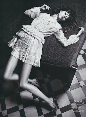
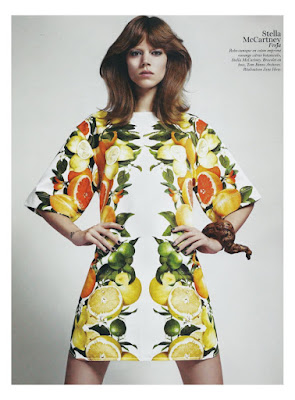
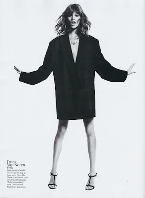
Never mind that these shots don't tell a cohesive story. They aren't supposed to when they're designed to showcase the past season's top designer looks. Heck, they don't need to when you can find a story in each shot, in and of itself. This is an editorial packed with imagery; a visual punch to the senses. Each frame stands on it's own, each extols different merits, each displays different facets of the model that Freja has grown to become. When you can take any shot, blow it up and make an awesome poster out of it, you know it's good.
It's quite an editorial, and all the models play their parts exceedingly well. I can't remember the last time I liked every component of something so much. If you have to leave Carine, this is surely the way to do it. With a bang instead of a whimper. With the masses wanting more.
Image Credits: scans by tFS member Carla-A
Showing posts with label Jane How. Show all posts
Showing posts with label Jane How. Show all posts
Thursday, January 20, 2011
Thursday, August 27, 2009
Show us How it's done Jane
Freja's new editorial in V Magazine is such a breath of fresh air. If you're tired of jumping editorials shot in the studio against a gray background, this is your antidote. The antithesis of any editorial you will find in US Vogue. Full of creativity, fun, whimsy, and spontaneity thanks in large part to the work of stylist Jane How (pictured above).
Sorrenti is a great photographer in his own right, but I really think the clothes make this editorial and we have Jane's ingenuity to thank for that. She frequently styles runway shows for Maison Martin Margiela (she was responsible for the infamous collection shown on life-sized marionettes operated by actual puppeteers.) In addition to working for Margiela, Jane has acted as creative director for Hussein Chalayan, another avantgarde designer who relies more on artistic sensibility rather than commercialism when designing his clothes. One of her earliest jobs was styling for i-D Magazine so you can see a common thread in that Jane aligns herself with the cutting edge of fashion. She works on this edge, right where fashion begins to intersect with art and her stylistic approach absolutely reflects this. She has a flair for the dramatic and isn't afraid to be innovative, pulling looks from less well-known designers.
The outfits she pulls are quite simple and straight forward, but her ability to combine pieces is what makes this editorial so memorable. She has used all the right looks from the right designers in order to evoke a sense of awe and wonder, comparable to the awe and wonder you feel when standing in the middle of New York's Times Square. However, the clothes and accessories are perfectly edited with Jane's great eye so you don't feel completely overwhelmed. And they hold their own against the strong city landscape, resulting in a nice dialogue. The architecture of the buildings and the clothes play off of each other, enhancing each other in the process. The whole thing is quite subversive and that's why I think it's so brilliant.
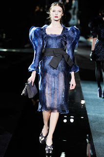
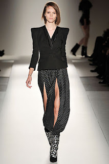
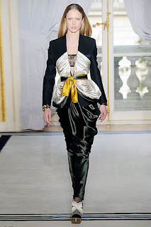
It is always interesting to see how runway looks are interpreted by stylists in the pages of magazines. I have a particularly hard time envisioning how an outfit will look off the runway, which is why I love editorials set in the streets so much. I know they're not exactly good representations of reality, but they give my imagination fodder and I can begin to see the versatility, wearability and transformative power of the designs. Take a look at the editorial versus the runway and I think you'll appreciate the beauty of the editorial and Jane's styling even more.
After looking at these runway looks, I really wish this editorial had been in color. The contrast between the glamor of the clothing and grittiness of the city would have been more apparent and stark. But maybe this was intentional? The b&w photography and shallow depth of field blends all the elements of the photographs together. As a result, you really have to look to see everything because the distinctions between background, foreground, models and buildings almost become obsolete. And for a shoot like this, you definitely need veteran models at the top of their game. Newer girls would have been engulfed by the clothes, setting and shooting style. But Freja and Sasha are two of the strongest models, both in personality and look.
There is so much more to say about this editorial, but I think I've said enough. Overall, I really think everyone delivered on all aspects, and I haven't been this excited to see something in print in a long time.
Image Credits: i-dmagazine.com, style.com, catwalkgenius.blogware.com, runway.blogs.nytimes.com, vmagazine.com via tFS member TERRYWORLD
Labels:
Editorial,
Jane How,
Mario Sorrenti,
V Magazine
Subscribe to:
Posts (Atom)

