Ever since I've seen the images from Freja's new Vogue Paris editorial, I've had Joy Division's Love Will Tear Us Apart in my head for obvious reasons. And maybe it's fitting that I do, because I can't get the first image and all it's lingering emotions out of my head.
En Vogue l’Été
Vogue Paris February 2011
Ph: Mario Sorrenti
Styling: Jane How
Other Models (not pictured): Daphne Groeneveld, Daria Werbowy, Joan Smalls, Lara Stone, Natasha Poly, Sasha Pivovarova, and Saskia de Brauw
If you can only dwell on one image from this editorial, make sure it's the first one. Make sure you view it in full size and make sure that you give it a good, long look. For if you do, you will be privy to one of the most touching and expressive moments from Freja's work in a long time. Notice the mascara touched trail of a tear down the cheek and the pain in her eyes. The emotion is tangible, but somehow paradoxically made subtle by the necklace's pronouncement of "tears us apart." All the noise is concentrated there. So if you're not careful you might miss this woman who is suffering such woes that not even being outfitted in head-to-toe Chloe can remedy her sadness.
Never mind that these shots don't tell a cohesive story. They aren't supposed to when they're designed to showcase the past season's top designer looks. Heck, they don't need to when you can find a story in each shot, in and of itself. This is an editorial packed with imagery; a visual punch to the senses. Each frame stands on it's own, each extols different merits, each displays different facets of the model that Freja has grown to become. When you can take any shot, blow it up and make an awesome poster out of it, you know it's good.
It's quite an editorial, and all the models play their parts exceedingly well. I can't remember the last time I liked every component of something so much. If you have to leave Carine, this is surely the way to do it. With a bang instead of a whimper. With the masses wanting more.
Image Credits: scans by tFS member Carla-A
Showing posts with label Mario Sorrenti. Show all posts
Thursday, January 20, 2011
Wednesday, September 29, 2010
Think Punk, Think Again
Oh boy. I'm going to try and make this short and to the point. Seeing that Paris Fashion Week just started, I think we'd all rather dwell on that than this.....
Think Punk
Vogue Paris October 2010
Ph: Mario Sorrenti
Styling: Emmanuelle Alt
This editorial challenges me for sure. It challenges my tastes, it challenges my notions of beauty, it challenges my ideas of Freja. I never thought it would be possible to make her look so unattractive and harsh. I'm trying really hard to find some redeeming qualities in this, and not to let my own personal notions of beauty determine whether this editorial is good or bad. But it's really difficult for me to get past the way Freja looks. Call me shallow...I don't care.
I get the impetus behind the editorial concept. I'm familiar with the whole punk scene and it's history, but I'm just disappointed that we get this in the 90th Anniversary Issue of Vogue Paris. My expectations were raised so high....maybe too high. On the other hand, I know I should just be happy that Freja is included in the issue (twice!). And I suppose that she is even further expanding the range and testing the limits of her look and portfolio. Love it or hate it, it's most definitely something that pushes the boundaries of her modeling work. And it contributes to the notion that she's one of the most versatile models working today. Not many can go from this, to this so easily and effortlessly.


Sigh. What do you guys think? Maybe some of you are better at looking past the obvious and finding the beauty beneath. For as they say, beauty is in the eye of the beholder. Although, one thing I cannot and will not stand about this editorial is that it further entrenches Freja within certain stereotypes that have followed her around for the past two years. Yes she's tough. Yes she's cool. Yes she can be androgynous. Yes she has tattoos. We get it already. Now it's time to move on and show us other sides to her modeling persona, instead of repetitively highlighting this one. But I guess all models have a shtick they can't get away from....Lara and her boobs immediately come to my mind. And maybe that's a good thing because it means the model is memorable and the model is known. In such a fickle industry, I guess that's all that matters....or is it??
Image Credits: Scans by Carla-A at tFS
Think Punk
Vogue Paris October 2010
Ph: Mario Sorrenti
Styling: Emmanuelle Alt
This editorial challenges me for sure. It challenges my tastes, it challenges my notions of beauty, it challenges my ideas of Freja. I never thought it would be possible to make her look so unattractive and harsh. I'm trying really hard to find some redeeming qualities in this, and not to let my own personal notions of beauty determine whether this editorial is good or bad. But it's really difficult for me to get past the way Freja looks. Call me shallow...I don't care.
I get the impetus behind the editorial concept. I'm familiar with the whole punk scene and it's history, but I'm just disappointed that we get this in the 90th Anniversary Issue of Vogue Paris. My expectations were raised so high....maybe too high. On the other hand, I know I should just be happy that Freja is included in the issue (twice!). And I suppose that she is even further expanding the range and testing the limits of her look and portfolio. Love it or hate it, it's most definitely something that pushes the boundaries of her modeling work. And it contributes to the notion that she's one of the most versatile models working today. Not many can go from this, to this so easily and effortlessly.


Despite the harshness of Freja's look, her hair, the styling, and everything; I admit that I am impressed with the little moments of softness in the last shot above and the first shot below. Maybe I'm just reaching for anything good, but I see a tenderness there that's actually quite alluring, and not always present in Freja's other work.
Image Credits: Scans by Carla-A at tFS
Tuesday, April 6, 2010
Campaign News - Max Mara
She's done it! Freja has landed the F/W 10.11 Max Mara ad campaign shot by Mario Sorrenti. Perhaps not the biggest surprise considering she opened and closed the runway show, but a surprise nonetheless as it's a new campaign for her and she's not really known as a Sorrenti fave. Beside, we all know that opening and closing a show doesn't guarantee a model anything. (How many times has Freja opened and closed Akris? And instead Daphne Guinness has the campaign once again.)
Thanks to mikel at tFS for breaking the news:
Even though the campaign might look similar to last seasons' as Max Mara always seems to have the same look to it's campaigns, I can't wait to see it. And just for the record, Freja also opened and closed the Isabel Marant runway show this past season.....
Image Credits: style.it
Thanks to mikel at tFS for breaking the news:
"The face belongs to the Danish top model Freja Beha Erichsen: large, dark eyes, an angular face, a slim figure. Immortalized by the legendary photographer Mario Sorrenti. These are the two protagonists of the fall-winter 2010-2011 campaign by Max Mara, shot in Paris, which depicts the essential elegance of the label with an all black and white look at the collection. Hair and make-up have been created by Luigi Morenu and Aaron De Mey fpor Streeters. This is an "encore" performance for Sorrenti who also shot the fall-winter 2009 campaign featuring the model Eniko Mihalik."I think it speaks loads to Freja's modeling ability that two labels generally thought of as very classic (Chanel and tweed suits, and Max Mara and camel coats) have her as their campaign girl. Classic isn't exactly the first thing that comes to mind when people think of Freja--edgy, modern, and androgynous are more the norms. But the classicism is there in the refined lines and structure of her face. The clean beauty that Freja is capable of portraying is the perfect compliment to the simple but elegant clothing of Max Mara. It's a pity that her off-duty persona has grown so much that it overshadows the many different facets that she's capable of expressing in her modeling work.
Even though the campaign might look similar to last seasons' as Max Mara always seems to have the same look to it's campaigns, I can't wait to see it. And just for the record, Freja also opened and closed the Isabel Marant runway show this past season.....
Image Credits: style.it
Labels:
Ad Campaign,
Campaign News,
Mario Sorrenti,
Max Mara
Monday, February 22, 2010
New Editorials and London
Here are two of Freja's March magazine madness editorials:
Chic Mystique
W Magazine March 2010
Ph: Mario Sorrenti
Love At First Sight
Vogue US March 2010
Ph: Steven Meisel
I'm just so happy to see Freja in US Vogue that I can't really say anything substantive or meaningful about the editorial. Usually I'm apathetic towards standard studio edits, but this one is special, obviously. And the rest of the cast is so great that I don't mind that Freja only has three shots. I like to think of this as a stepping stone to bigger and better things, hopefully. Finally US Vogue is changing up their model casting. In addition to Freja, this issue also boasts debuts for Abbey Lee, Patricia van der Vliet, and Mirte Maas! If Anna Wintour keeps this up I'll actually be looking forward to getting my copy of Vogue in the mail every month. Now...if we could just get her to do something about those awful celebrity covers....but even that might be changing in the near future. I swear, this entire month has seen the fashion world turned upside-down and inside out, especially for us Freja fans.
Anyway, as you all know by now, Freja is in London and she's already walked two shows, one of them a debut for her: Julien MacDonald and Acquascutum. The craziness continues, so if you thought this week was going to be a nice break between New York and Milan, think again. London is the place to be right now as a lot of models are walking there this season (think Anja, Abbey, Freja, Karlie, Sigrid, etc). I think this is great for a city that's generally overlooked. Collections have been strong so far so take a look when you get the chance.
Oh, and thanks to tFS member s'gnac, we have a preview of Freja's SPUR cover. I guess that means it's out in Japan and hopefully we'll be able to see some scans of the story eventually.
Image Credits: My scans, amazon.co.jp via s'gnac @ tFS
Thursday, August 27, 2009
Show us How it's done Jane
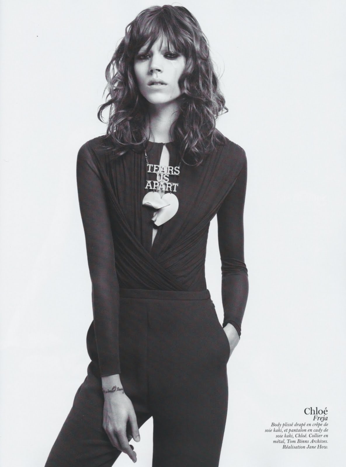
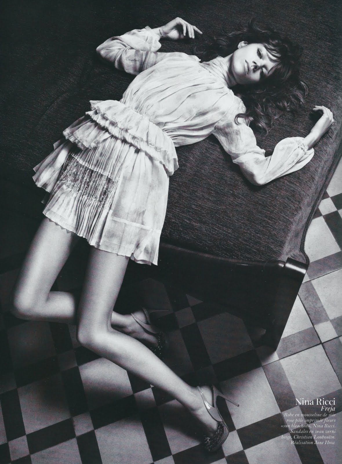
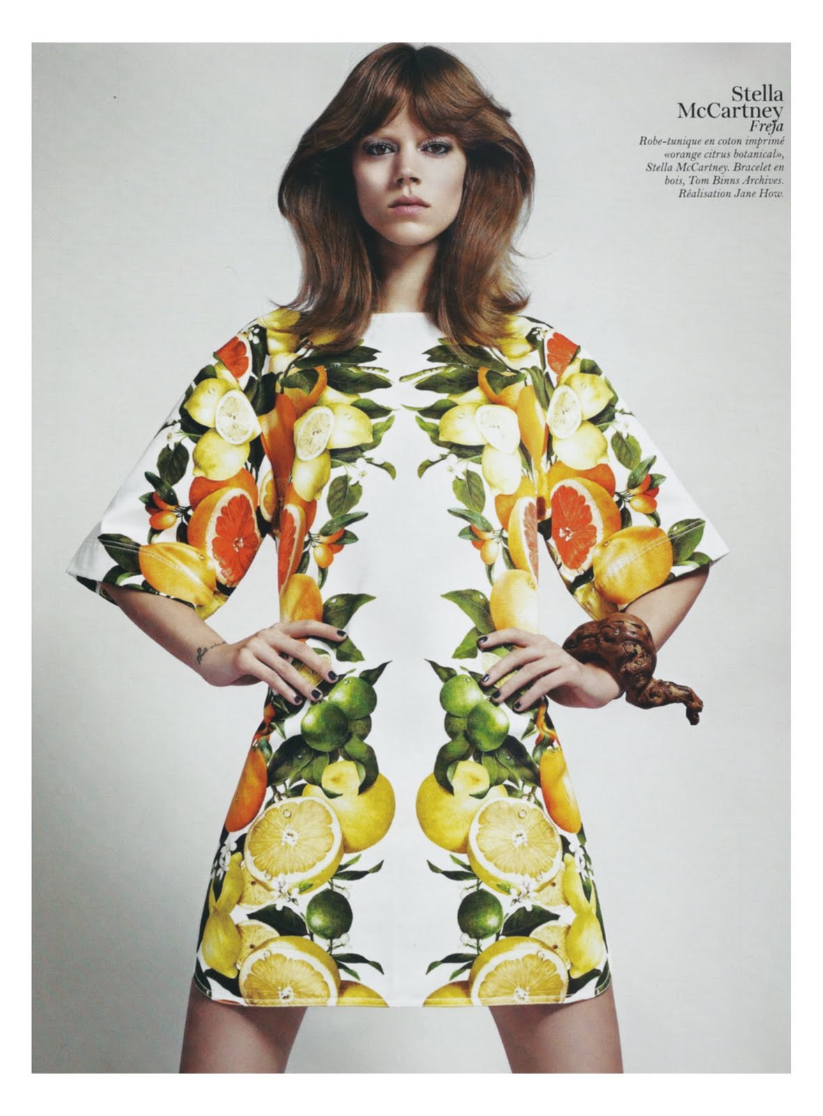
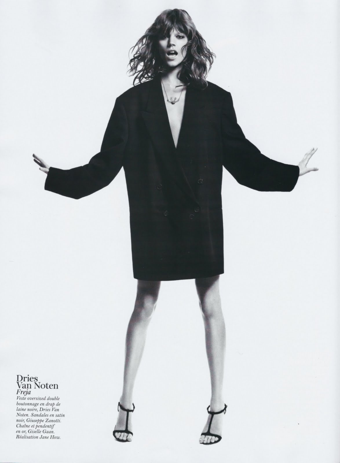
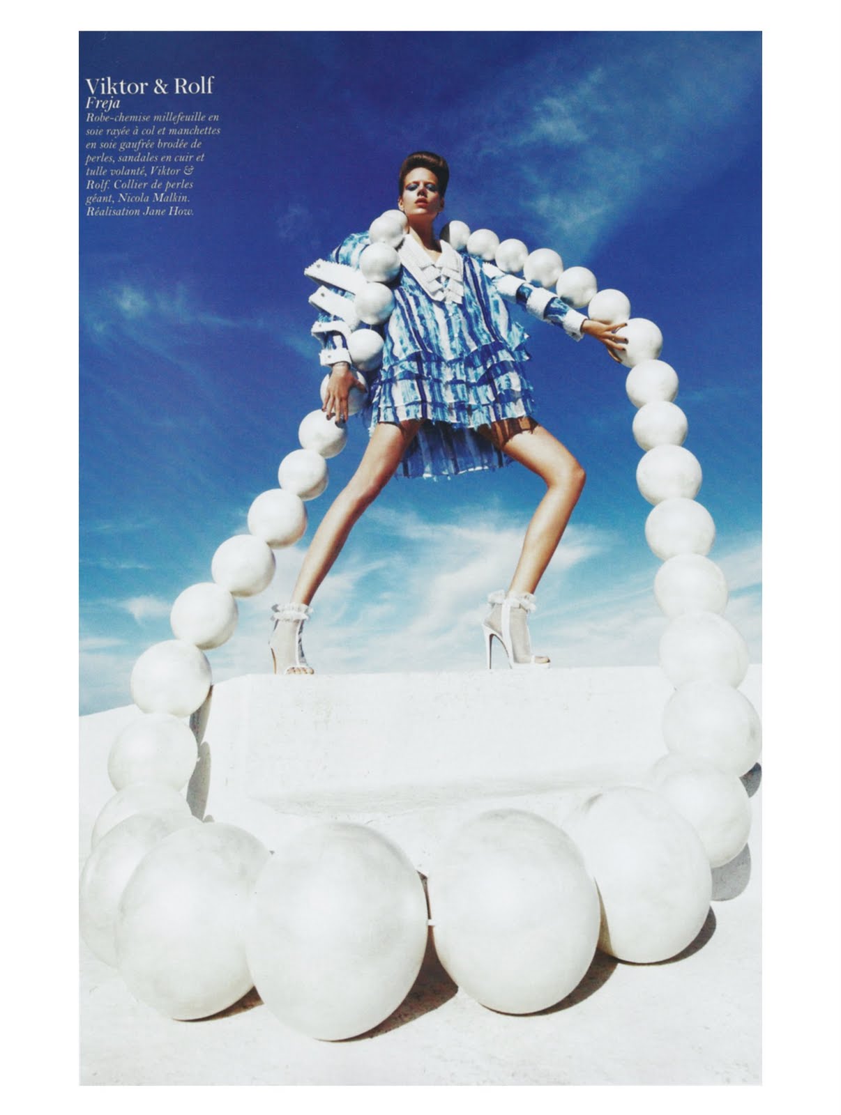
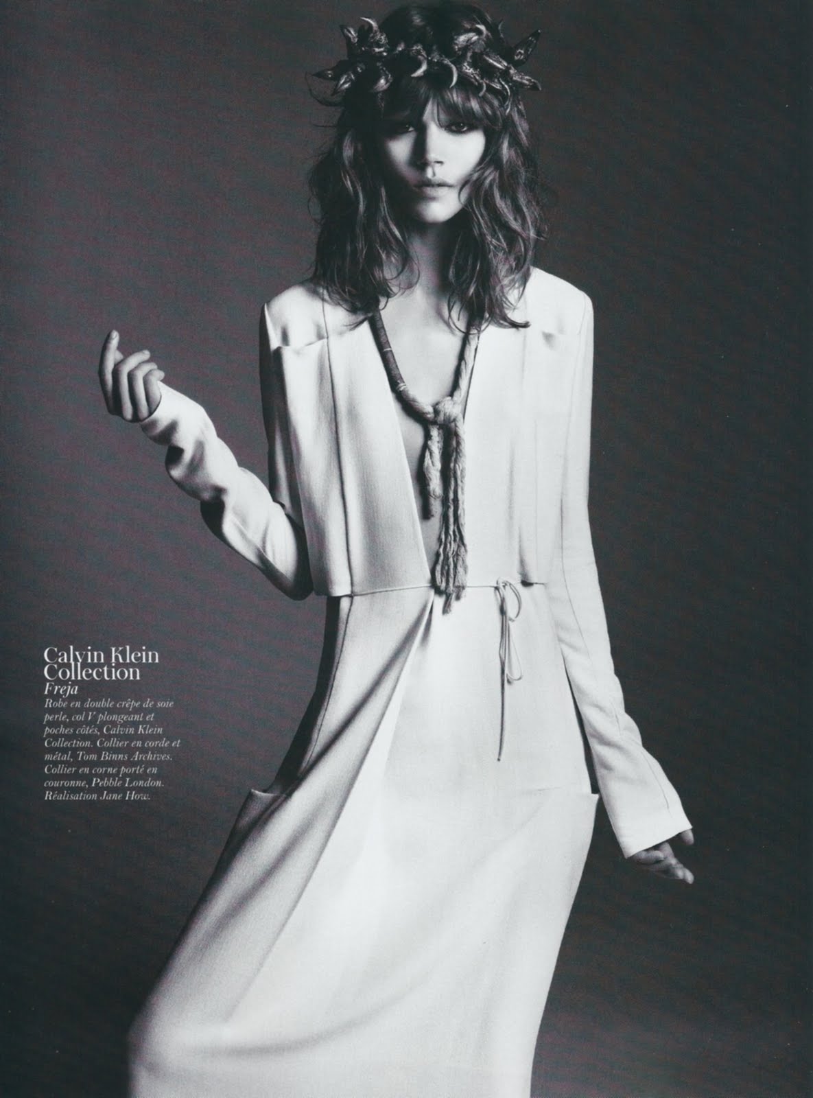
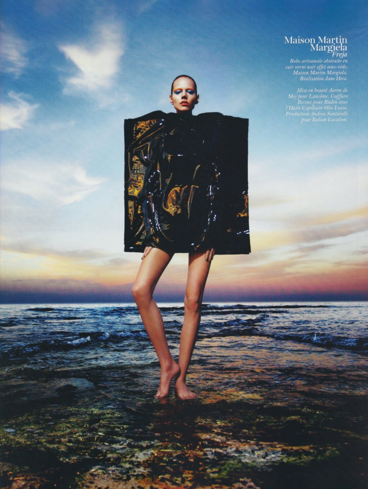
Freja's new editorial in V Magazine is such a breath of fresh air. If you're tired of jumping editorials shot in the studio against a gray background, this is your antidote. The antithesis of any editorial you will find in US Vogue. Full of creativity, fun, whimsy, and spontaneity thanks in large part to the work of stylist Jane How (pictured above).
Sorrenti is a great photographer in his own right, but I really think the clothes make this editorial and we have Jane's ingenuity to thank for that. She frequently styles runway shows for Maison Martin Margiela (she was responsible for the infamous collection shown on life-sized marionettes operated by actual puppeteers.) In addition to working for Margiela, Jane has acted as creative director for Hussein Chalayan, another avantgarde designer who relies more on artistic sensibility rather than commercialism when designing his clothes. One of her earliest jobs was styling for i-D Magazine so you can see a common thread in that Jane aligns herself with the cutting edge of fashion. She works on this edge, right where fashion begins to intersect with art and her stylistic approach absolutely reflects this. She has a flair for the dramatic and isn't afraid to be innovative, pulling looks from less well-known designers.
The outfits she pulls are quite simple and straight forward, but her ability to combine pieces is what makes this editorial so memorable. She has used all the right looks from the right designers in order to evoke a sense of awe and wonder, comparable to the awe and wonder you feel when standing in the middle of New York's Times Square. However, the clothes and accessories are perfectly edited with Jane's great eye so you don't feel completely overwhelmed. And they hold their own against the strong city landscape, resulting in a nice dialogue. The architecture of the buildings and the clothes play off of each other, enhancing each other in the process. The whole thing is quite subversive and that's why I think it's so brilliant.
It is always interesting to see how runway looks are interpreted by stylists in the pages of magazines. I have a particularly hard time envisioning how an outfit will look off the runway, which is why I love editorials set in the streets so much. I know they're not exactly good representations of reality, but they give my imagination fodder and I can begin to see the versatility, wearability and transformative power of the designs. Take a look at the editorial versus the runway and I think you'll appreciate the beauty of the editorial and Jane's styling even more.
After looking at these runway looks, I really wish this editorial had been in color. The contrast between the glamor of the clothing and grittiness of the city would have been more apparent and stark. But maybe this was intentional? The b&w photography and shallow depth of field blends all the elements of the photographs together. As a result, you really have to look to see everything because the distinctions between background, foreground, models and buildings almost become obsolete. And for a shoot like this, you definitely need veteran models at the top of their game. Newer girls would have been engulfed by the clothes, setting and shooting style. But Freja and Sasha are two of the strongest models, both in personality and look.
There is so much more to say about this editorial, but I think I've said enough. Overall, I really think everyone delivered on all aspects, and I haven't been this excited to see something in print in a long time.
Image Credits: i-dmagazine.com, style.com, catwalkgenius.blogware.com, runway.blogs.nytimes.com, vmagazine.com via tFS member TERRYWORLD
Labels:
Editorial,
Jane How,
Mario Sorrenti,
V Magazine
Subscribe to:
Posts (Atom)