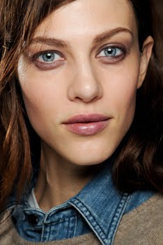
Colour Shock
Vogue UK August 2010
Ph: Josh Olins
Styling: Lucinda Chambers
The styling is perhaps a little safe, but the first few editorials showcasing new season looks always have to be. These are the first time the clothes are displayed in the magazines and to the "general public," so of course you don't want to over style them or mix and match them too much to the point where they're unrecognizable. Expose them and show them in all their glory, and cultivate that desire for consumption that you do so well Fashion.
The colors are a dream though (as well as those Balenciaga heels), proving the talents of Lucinda once again. So bright, fresh and light. Not only does she manage to take Fall/Winter clothing and create a story appropriate for the summer release of this issue, she also makes the clothes express a whimsy and cool, refreshing quality that belies their colder weather purpose. Lucinda is the type of stylist who makes you realize that it isn't always just the photographer or model who makes or breaks an editorial. Styling plays a large, albeit much less obvious, role as well. From the first time Freja and Lucinda worked together back in September of 2005 to this time nearly 5 years later, I can honestly say it's a working relationship that I love and always look forward to seeing because it never disappoints me. Think of all the great work Freja has done for the magazine, and nearly every instance you'll see Lucinda credited as the stylist. It's really an amazing history and I never want to see it end.
Well folks, after a bit of a quiet spell for the months of May, June and July, it appears that Freja is back in full force and ready to tackle the Fall fashion months ahead! Couple this with all the ad campaigns breaking and Haute Couture shows starting shortly (Monday, July 5th!!) and we've got enough Freja news to hold us over until the SS10 runway show season.
Image Credits: scans via tFS member fearless123


3 comments:
Very excited about the couture shows starting, even though the fact that Givenchy is only going to do a presentation is a bummer.
But anyway, I really like how simple this editorial is. I'm obsessed about Josh's work and his collaborations with Freja have been pretty fabulous.
Love the shot where she's wearing head to toe Balenciaga. I seriously need those shoes in my life.
I really was happy that you posted articles arguing about Terry Richardson's doings since I did not know any of them until i visited your blog simply to take a glimpse of Freja. It may not stir a huge debate yet, but over the time people will receive the message, especially when there are increasing people who adore Freja and come visit your blog :).
This is a great blog
Post a Comment