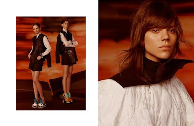
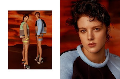
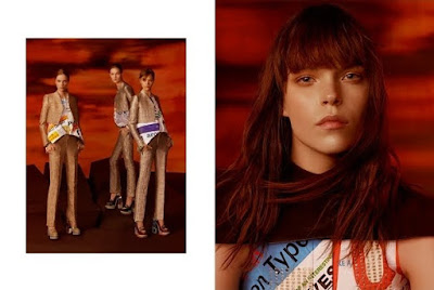
I really think I love this. If it looks this eye catching in these low-res images, then I can only imagine how great it will look in the magazines. Things always look better in print, especially Balenciaga ads that seem to be made with the two page magazine format in mind. Remember last season's cut and paste job? Perfect example of how to engage readers by utilizing the inherent qualities of the format at hand. Not everyone liked the ads visually, but as tactile and tangible pages, I felt they were immensely successful.
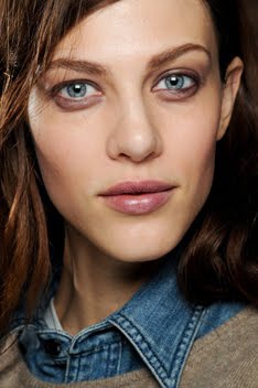
Anyway, I also really love the unconventional model choices. Each girl is unique enough on her own that you really don't think they will all mesh well together to create one coherent campaign. But when you see the full set of images, you begin to understand that it's their quirks that bind them together. It's like one magnificent family portrait series. The focus on each girl is so serious and intense that it feels like a psychological study. And even though the aesthetics are nothing alike, I get a sense of Johannes Vermeer and his portrait work. I feel it most in the quiet gravity of the atmosphere and the heavy presence of the individual persons. In the following comparison, the use of clothing is of particular interest.
Maybe I'm the only one that sees any relation, but I do. It's by no means obvious; just more about the feeling I get, the response I have and the associations my minds draws up. Modern day women wearing very modern clothes, yet posed and captured in such traditional ways. It's this collision (no pun intended) of old and new, traditional and progressive, classic and modern, that makes these images quite captivating. But enough analyzing for now. I can't wait to see these in HQ!
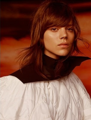
In other news, if you want to read a great piece of writing on Freja and the impact of her latest VP editorial, please check out Fashion Does It Better. It's thoughtful, beautiful and it really says it all.
"In the recent rush for breaking the rules or boundaries, many actually miss the start and often forget that the actual backbone of fashion (and fashion photography) is its ability to let one's face and body express and feelings explode."When I read something like this I feel refreshed and inspired again by the insight and intelligence that fashion is capable of breeding.
Image Credits: balenciaga.com via tFS member tarsha, artnet.com





5 comments:
This is campaign is very good imo. Love her closeup and I know not many people are liking the group shots, but I actually do like them. Freja and Valerija Kelava in one shot is just...too much for me. I need to see these in HQ.
I like how soft she looks even if the background has that tough and even apocalyptic look to it.
^I'm with you regarding Valerija and Freja. Need HQs now! :)
thanks for this blog
don;t you think that Freja and Meghan Collison look alike?
^At first I did. But I think that had more to do with the type of hairstyle Meghan had, rather than any specific facial feature.
Nicee share
Post a Comment