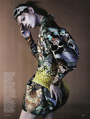
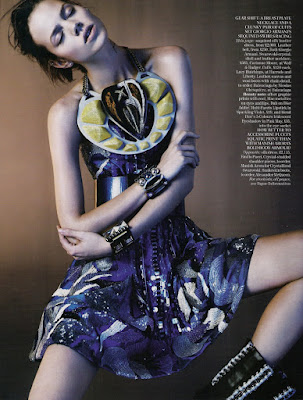
Freja continues her long running Vogue UK relationship with a new editorial.
Cyber Tribe
Vogue UK, March 2010
Ph: Josh Olins
The colors! The feminine styling! Freja has finally moved firmly away from the androgyny that was (in my opinion) stifling her abilities and limiting the work she got. It's great to see her in a beautiful editorial like this. Even though it might not be the most inspired one ever, it's a welcome change of pace. And the people at Vogue UK sure do know how to do a studio editorial right.
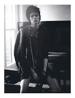
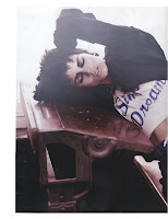
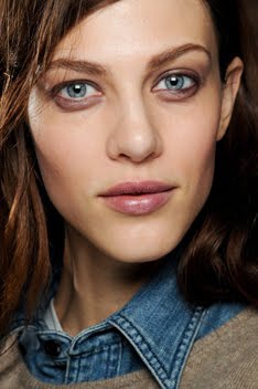
A thing that immediately struck me about this is the prominence accorded to Freja's tattoos. In some pictures they seem to be as much of a focal point as the clothes are. I suppose when you've been in the industry for half a decade, the people who book you know what they're getting and are more apt to let your personal aspects shine through. Anyway, it takes an editorial like this to remind me what a great print model Freja is. Her face is just subtle enough that she can take a variety of looks, yet powerful enough that she doesn't get overwhelmed by her surroundings. All the different angles of her face photograph well, and she's gotten better at posing too. But that's probably partly attributable to the photographer. If you compare this editorial to the last one Freja shot with Josh, you'll see some similarities.
You rarely see Freja like this in, say, an editorial by Karl. So it shows us that she's capable of giving the photographer exactly what he/she wants, which is something all great models can do. It doesn't matter if you have the right look; if you can't work well with people then you're nothing more than a one-season wonder at best.
This piece was edited/styled by Lucinda Chambers, who also styled one of my favorite Freja eds from last year. I think she has this signature style that seems haphazard at first glance, but quickly moves into wonderful cohesion the more you look. Anyone can throw black on black on white together, but successfully styling prints, patterns and colors together is a completely different story. It takes a bold eye and lots of experience, which Lucinda has. After all, she's been working with Freja since the beginning of her career with the first editorial she shot for Vogue UK. Since then she's basically styled/edited almost everything Freja's done with the magazine. So with their amazing track record of working together (especially in what has to be my favorite Freja editorial ever), I truly look forward to the next thing they'll produce because you can bet it will be visual wonder.
Image Credits: Scans by tFS member fearless123 and tFS member Carla-A
Subscribe to:
Post Comments (Atom)







10 comments:
Someone on TFS mentioned a new tattoo on Freja's left fingers next to the finger with lines.
what do you think?
^That tattoo is not new - probably almost a year old. It's difficult to read, but it could be the word "Security" according to some guesses.
love it beyond words, new, exciting, surprised!
The colors of this one is definitely bold and actually glaring such that it takes alot of attention off the model? Despite that, she wasn't overwhelmed, she did great here. And yes, love it that she's a WOMAN, totally agreeing with you.
She looks gorgeous!
her face looks amazing, and the poses in that clothes are stunning.
You're right, she's so versatile, that's why I love her.
She is my fav,,, and I love your blog
She looks divine in the images you posted! And this new tattoo, I want to see it!
I didnt know this blog.
awesome!!!
I really like the pictures of this model. She looks beautiful wearing these creative items of clothing.
I really like this site, it's so important to know more about this topic, keep it up and of course every time I have time I'll love to check out again
Post a Comment