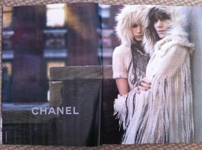
Here are the first snaps of the Chanel F/W 10.11 campaign:
Way too early to make my judgment yet, but I will venture to say that things don't look so bad. I don't know what I was expecting with the outrageous collection, but the contrast of the soft furs against the hard, brick and mortar NYC landscape is quite nice. It seems to be one of those odd pairings that end up working--the qualities of one offsetting and enhancing the other's.
I just love the shot of Freja and Abbey together. Their embrace mimics the enveloping embrace of the clothing, and their facial expressions are quite wonderful in their contrast as well. A smirk on Freja's; and impenetrable gaze on Abbey's. Maybe "contrast" is the wider theme at play here. But I won't know for sure until we see the whole set.
Speaking of, I always end up liking the complete campaign after I get to look at all the images, so I'm hoping Chanel sets up a section on their website like they did for last season's Latin Lover campaign. Just from these quick snaps I can already tell that I'm inclined to like this campaign way more than the Max Mara campaign. And yes, if Fashion Week Daily is to be believed, those images are indeed the Max Mara campaign and not part of a lookbook. What a letdown....
Image Credits: snaps by tFS member nothingless
Thursday, July 1, 2010
Subscribe to:
Post Comments (Atom)


5 comments:
I have always wondered how people on TFS get these images so quickly. The pre-fall Chanel campaigns have just started rolling in a month ago
Anyway, I am wondering if you are going to blog about the Vogue Nippon editorial with Terry Richardson or are you tired of talking about Richardson. I personally really like the shoot, his outdoor shoots are a lot better than his studios. I would love to see what you think.
^The post about the editorial is coming. It's just a very difficult and delicate subject to broach.
I'm dissapointed about the Max Mara ads. I thought they were going to be different, and obviously less photoshop. I kinda wished they were like Lara and Vlada's Max Mara campaign.
That was black and white and fierce.
I love the pictures, the couple between Abbey and Freja is very good, and the site ... I was surprised when I saw the making off in the city for an extravagant collection but in the end a great job.
And of curse I love this more than the Max Mara campaing.
Kisses
Interestingg read
Post a Comment