

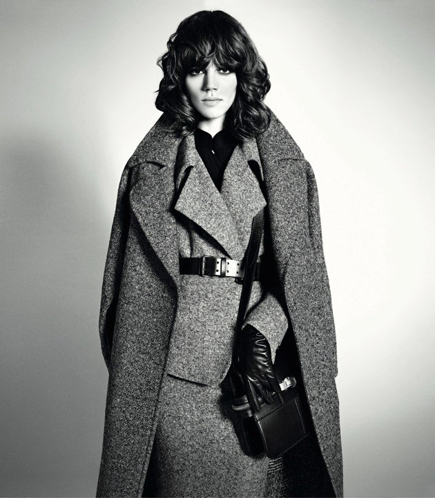


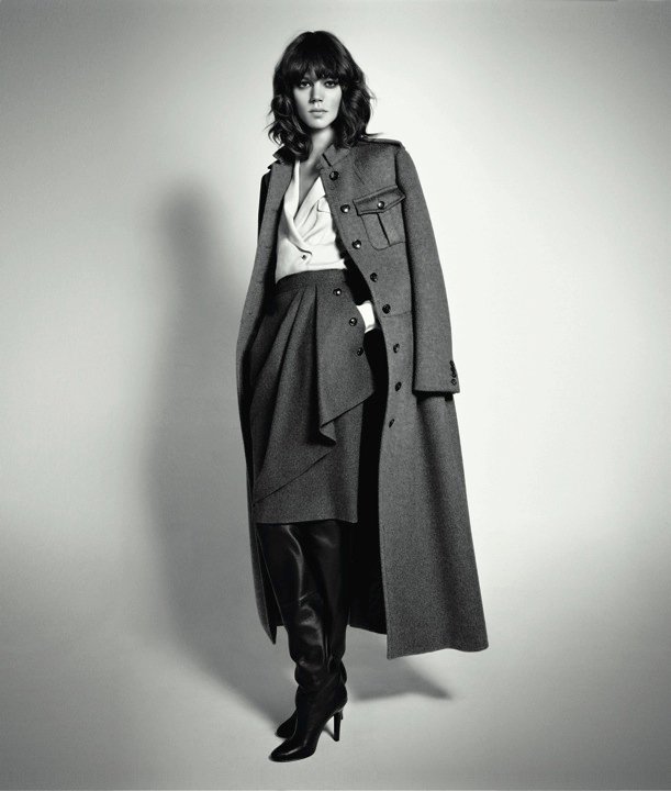


After seeing this whole set I want to believe that these are just lookbook images, because these as a campaign would be pretty disappointing. I mean, when was a Max Mara campaign ever shot in black & white? And I know their campaigns are usually pretty minimal, but this would be taking things to an extreme. The images also seem too raw and bland to be a fully formed ad campaign. I don't know....what do you think? Actual campaign? Or something else?
Also, thanks again to the anonymous commenter for the tip! You're like my very own fairy god mother. :)
Image Credits: Max Mara Mexico Facebook


7 comments:
I think it might be the campaign photos. If you read back the quote from vogue.it that mikel from tfs posted, it says Sorrenti was depicting an all black and white look at the collection.
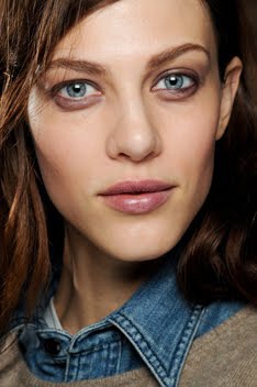
The hairstyle is horrible at the moment. I hope it will look better in a few months or she cuts it again. Curly hair styled like this doesn't fit with her rather thin face.
I can tell if a model is Freja even when her face is small like my pinky nail, but I can't even tell these are pictures of Freja. I have never said this about any of the pictures Freja is in: these disgust me.
It is not even that she is Freja and I am a Freja fan. I just simply don't think any model deserve to be photoshopped so much that his/her face looks disproportionate and does not even look like his/herself.
I don't think it's so much a problem of extreme Photoshopping - sure, the images are a bit too "sharp" with artifacts around the eyes for example. The main reason Freja looks so bad IMO is the hairstyle in combination with her thin narrow face. It almost looks like a bad wig. Horrible. No more curly hair for Freja, please.
I'm quite fond of the first image you posted though. It presents a more mature and sophisticated image of Freja. Frankly I am getting dreadfully bored of the constant parade of Dolores Haze(s) in fashion - especially with that first image from the Valentino campaign - feels as if it's 1955 all over again.
beautiful shoot , she's amazing
there has been a shopped job, but you also have to consider the type of lightning used. its not that bad. Maybe the shots might look worst non-printed.
Post a Comment