Tom Ford Eyewear F/W 10.11
Ph: Tom Ford
Other Models: Nicholas Hoult
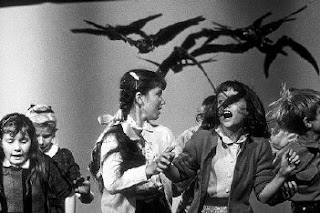
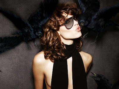
Now that the full campaign has been released, you can see why Ford went with a model like Freja this season. The eccentric, yet gorgeous qualities of her face perfectly mirror the dichotomy contained within the campaign images. There's a dialogue (and maybe even struggle) between maliciousness and absurd camp. The ravens are clearly meant to be a threatening element. Anyone who has seen Hitchcock's The Birds can attest to that.
Yet the facial expressions of both Freja and Nicholas betray, and even embrace the menacing aspect of their surroundings. "Why yes, birds are about to peck my body but I'll just act like they're nothing more than some harmless butterflies. And look! I'm even going to kiss one. Nevermind that another one just tried to eat my nipple."
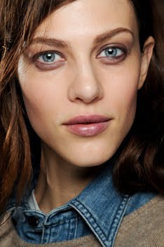
Freja is just the type of model to carry this off. She's gorgeous no doubt (as 5 years in the industry and countless campaigns and eyewear ads can attest), but she's also quirky enough that she's not just another boring, beautiful face. There's an intelligence in her look that some people often write off because they just can't comprehend it. Or maybe they've only ever known Freja as the androgynous, tomboy model so they can't look past thair narrow way of thinking. Yet, all of the work she's done for the past year or so has countered that old image of herself, and some people still won't see her as anything more than the androgynous one. Sigh. I guess that's the power of having a unique image while all your peers kind of blend into one big blond hair, blue eyed Eastern European mass. But I digress...
The campaign aesthetic is a bit unexpected, but overall the images still retain some of the glamor we've come to associated with Ford's name. Chalk it up to the styling and dark, moody nature of the setting. All of this sure makes for one memorable campaign. I have a feeling that people are either going to love this or hate it, but one thing they won't feel is apathy. You have to love that about Tom Ford and his campaigns, for they always push boundaries. And in the cautiously recovering economic climate, isn't that a good thing? Isn't passion the one thing that all designers are trying to ignite in their customer base and the general public?
Image Credits: tomford.com, thepassionatemoviegoer.blogspot.com, best-horror-movies.com
Subscribe to:
Post Comments (Atom)


13 comments:
Is the 3rd one the one with the "strategically placed scarf"? HAHA
I wonder why people of the tfs are hating this campaign. I actually like it a lot, esp the one with her trying to kiss the bird. Either way, I admire both of their modeling skills, I would freak out with those birds around me flying like that.
^I'm pretty sure the birds were photoshopped in afterward. So no real animals or models were harmed in the shooting of this campaign. ;)
i thought Tom himself shot this, not Terry.
^sorry nevermind
I'm not understanding all the hate on these pictures either. When I first saw them, I just thought that they were stunning, regardless of the little cringe I made at the first one. After seeing other people's feedback though, seems I'm in the very small minority. TLo at Project Rungay did a mention of this campaign too and everyone there seems to hate it as well. o-o
I don't know, I thought it was pretty amazing...
OMG. i love the concept and i love their expression especially freja's.it somehow gives you the expensive and glamour vibe of Ford brand.i totally agree with u about Freja having a unique image.u can have as many as blue eyed, blonde, porcelain skin models.but, those that come with unique image and different look like Freja is the one that stands out and floats longer in the industry.=))
I love this campaign. A lot of people have been saying how Freja isn't a "Tom Ford Girl" but I really disagree. I don't think Tom has developed his own label quite enough to have a specific girl. I think Freja is a great choice for this. She provides the quirk, but then again is surprisingly sexy in this (I only say this because shes mostly stuffed into boyish editorials)
oh, of course they weren't really there! HAHA... I feel really stupid now.
Anonymous at 8:24PM: I feel the exact same way. It is sad that people only love Freja's more androgynous and serious works while her more quirky and fun ones don't get appreciated as much. It is true that Freja is androgynous and cool, but if you watch the documentaries and interviews of her, she is actually quite quirky, funny, and easy going in real life. I like the fact that the real Freja is shining through.
Your blog has now become my favourite....I am in all kinds of love with Freja. And I LOVE this campaign; it's cool, new and with a dark edge that I love.
This shoot is so lovely.I have no qualms with it.Its so modern yet i feel that the shape of the frames are really 60's inspired mixed with a 90's edge or is it just me.I think for a Tom Ford ad this is very fresh...y'know for one thing there are no tanned models but nudity and abit of brashness is what tom is known for and that i think is subtle in these images.Kind of toned down but the first pic is quiet horrid...thats what it evokes in me neways.i love it but it gives me a slight shiver down my back.Pain for beauty.
@ Tinsley: I definitely agree with you. Here she proves that she's just as capable of bring the sex as she is the quirk. Maybe she could eventually come to embody the new TF woman once he finally comes back to designing womens wear.
@ RedHead: Thanks so much for reading and commenting. :)
@ amy: The beauty and pain that you talk is something I see too and yet another dichotomy in this campaign. I have to say that the more I see these images, the more I like them for their complexity in tone and subject matter.
http://farm5.static.flickr.com/4081/4736155721_672dde4371_b.jpg
From the new Max Mara campaign perhaps? If it is than it's quite a departure from a charmingly sinister style of Tom Ford ads, albeit not without its own allure.
^Hmmm, not sure. Sure looks like it! Thanks for sharing that with me! I swear, it's people like you that keep this blog going. :)
Post a Comment