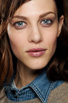
Karl Lagerfeld SS10:
Chanel SS10:


I think both sets make for striking images, especially when you see them in magazines. Haven't seen the KL ads yet, but the Chanel ones definitely stick out to me because of their insistent brightness. Interesting that Karl would choose to go completely dark for his namesake brand. I think it's rather fitting as I've always thought KL had a darker, more severe (in the German tradition) type of aesthetic message. And since the same two models are featured, the use of light and dark serves to develop a much needed distinction between the two brands. Although, if forced to choose, I'd probably go with the KL ads. I love how Freja and Baptiste's faces stand out against the black. And those ads really show how well they can work together.
Image Credits: designscene.net, my scans


4 comments:
I really love the KL campaign, just because it is much more of a portrait of freja and baptiste than anything else. freja is almost unrecognizable in the chanel ads. but they are quite nice as well, in their own way.
i dont know if its just me but there is something about freja and baptiste that screams brother and sister!
^I definitely feel the brother sister vibe as well. Maybe it isn't a coincidence that they're both favorites of Karl's. I guess we know his type....lol.
I prefer the KL ads. Though it is interesting that her tattoos are displayed in the Chanel ads and not in the KL ones. Maybe it was done on purpose? Maybe not?
^Anonymous: wow, good point!
I rather like the Chanel ads. But, I like the Karl Lagerfeld ads, too. Each has their own aesthetic appeal. The Chanel ads seem...mysterious and intriguing to me. There's something about the atmosphere and the stark lightness. I agree with Tinsley in regards to the Karl Lagerfeld ads.
Post a Comment