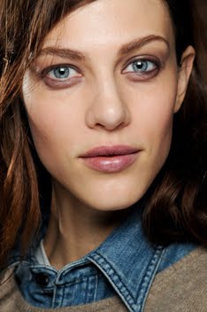
One of the things I enjoy the most about Freja's recent panoply of editorials is that they have given us the opportunity to see her work with people she doesn't normally work with. Patrick Demarchelier is the example here, and even though this new editorial isn't the most brilliant breakthrough of Freja's career, it is solidly decent, something different and shows us another side to her modeling skill.
Urban Renewal
Vogue UK April 2010
Ph: Patrick Demarchelier
Stylist: Lucinda Chambers
I'm a big fan of Lucinda's work and this editorial is no exception. It also helps that I absolutely love, love, love the trend towards modern, wearable, minimalistic clothes that real women who have real jobs can seamlessly integrate into their existing wardrobes (thank you Phoebe Philo!!). The clothes are straightforward and the styling, photography and model poses coincide with that aesthetic. Freja was the perfect girl for this shoot because I think her face personifies the mood of the layout; sleek, refined and modern, but not at the expense of being interesting.
Sure, it isn't ground breaking, but not every thing has to be. Sometimes you just want to see a good fashion spread with desirable clothes modeled by someone who knows what she's doing. Someone who's using her body in the best possible way to display the clothes. And lest we forget, that is the foundation of Freja's job after all, and she's damn good at it. For all the focus that's put on her personal life, who she's seen with and what she looks like off-duty, I can't help but feel that her abilities as a model are just an afterthought. I hope I'm wrong about this...and now that I think about it, that's probably the best summation as to why this blog exists. It's to bring the focus back to the work! Sorry for the tangent....
Anyway, Patrick's style can get very boring and repetitive, but under the styling hands of Lucinda I think this editorial is able to escape the mundane pitfalls of being just another plain studio edit. His style is distinct though. I see similarities between this editorial and the editorial that resulted from the last time Freja and Patrick worked together.
Proof that a photographer's direction has a lot to do with the way a model models? Yes, I definitely think so. Proof that Freja takes direction well and it easily malleable to different visions? Yes, I absolutely think so. Her body and her face are the creative vehicles and here she shows us that they are tuned up and in fine driving form.
By the way, who else thinks that Freja is waaaaay past due for a Vogue UK cover? Alexandra Shulman, the Freja fans are watching you. Don't let us down! You too Jaime Perlman. I know you're a fan....make it happen! (Hey, the return to femininity eventually happened after I griped about it many times last year. Maybe this will happen too, after I spend all of this year complaining about it. Ha!)
Image Credits: Beautiful scans of April issue of Vogue UK by tFS member fearless123, other scans by me
Subscribe to:
Post Comments (Atom)


3 comments:
I'm disappointed with this ed. her expression is almost the same in every single shot. it could be the photographers directions, but she just looks one dimensional this way
Have you seen her nude ed in Purple magazine?
It's um .. weird, I think. A bit too nude and too skinny for my sake, but if you haven't seen it, I just wanted to give you a heads up.
/Caroline
@ Torlich: Yeah I've seen it. Didn't think it was necessary to do a post on it, and I didn't want the blog reported for nudity...lol. Thanks though! I appreciate the thought. :)
Post a Comment