

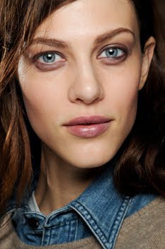
The cover was shot by Emma Summerton, who is a wonderful photographer. Therefore, I have a hard time believing that this was the best option for a cover shot out of all the images that she took. It doesn't really bear the distinctive and defining characteristics of her usual work. The hair is an overwhelming mop, the angle is distracting (making Freja look even thinner than she already is) and the styling is bland. Freja also looks rather menacing. I just don't believe in this image as a cover hailing the arrival of Spring. i-D covers are usually a complete hit or miss for me though. And compared to the last cover that Freja had, this one's shortcomings become even more obvious to me:

Then again, I'd be a very happy women if the words androgynous and/or boy and Freja never appeared in the same sentence ever again. At the very least I'm thrilled that Freja is working with Emma! Their first and only other collaboration yielded this lovely editorial with Lily. So hopefully the inside story will be a bit more inspired and polished in it's execution and aesthetic. One thing that I do kind of like about this cover is that it seems to capture the essence of who Freja appears to be off the runway. It seems like it could be a candid shot of her backstage during the shows; but ironically enough, that's also a reason why this cover doesn't work for me as a cover. It just seems amateurish. What do you think? Am I just too biased against anything androgynous when it comes to Freja, or do I have some legitimate concerns here?
And good god Freja...when was the last time you took a break from working? The rate at which you're putting out new work is alarmingly fast....not that I'm complaining. But still, I think my wallet and typing fingers could use a rest and I'm sure you could too.
Image Credits: ftape.com via tFS member Flashbang, scan by tfS member Diciassette (17)


11 comments:
I don't get all the hate across the boards for this cover. lol I like the angle. I like the simplicity. I don't think it looks menacing. I do think it looks very Freja. The other covers don't scream spring either, but I like them too. Maybe I'm just too simple and don't think too deeply about these kinds of things. lol
She can't possibly keep up this pace. I'm going to get really bored when she does finally take a break.
i love that i-D cover :)
@endia: I think that's my point, which I didn't make very clear...lol. It looks very Freja-ish, but I don't want my covers to merely look like the model. I want my covers to be transformative and inspirational. And in the context of the timing of the issues and the other covers, I just don't think that it's very cohesive or appropriate. But of course, that's just my two cents. And yes, I do have a huge tendency to over think things a lot. :)
i like the cover and i get it but it could have been a little more interesting...
I like the i-d cover way better than the vogue.
The i-d cover is somehow more honest and fresh.
It is as it is and I like that kind of simplicity.
Moreover, I like freja as herself.
And for me, nothing is wrong with androgyny when it comes to freja.
She's a natural. ;p
Thank you for this amazing blog.
This is almost like the Freja encyclopedia from one's view.
Btw, you didn't post and comment on the work she did for the purple magazine.
The naked purple. I've seen it and I can't find the hidden tattoo.
And I'm wondering, still wondering..
I love this cover. It reminds me of an 80's style shoot and Freja's expression is killer.
I just read in TFS that the cover was actually shot by Roversi and not Summerton.
Funny because it doesn't look like Roversi that much..
^ I'm pretty sure it was shot by Summerton - you can even read it on the cover (top right). Photgraphy Emma Summerton.
the Roversi-rumor is wrong IMO
Oh okay! Well someone said that Freja's mother agency said it was by Roversi, which is kinda weird considering her ed inside is by Emma.
Thanks for clearing that up :)
yeah,i like the I-D cover more than the Vogue cover.eventhough it is straightforward, it's more exciting and i definitely can feel spring from that cover.lol..
I'd have to agree with the general consensus here...That i-D cover is badass.
Post a Comment