In Grande Stile
Vogue Italia March 2010
Ph: Steven Meisel


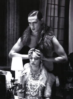
The thing I find most interesting and striking about this whole piece is the dissimilarity between the cover and story inside. After all, the cover connotes ideas of elegance, feminine beauty, and delicacy. You're led to expect a main editorial story much in the same vein; but what you get instead is delightfully surprising in that it's the antithesis of everything the cover stands for. Inside, you get an electric and tumultuous story replete with sexual perversity, passion, rage, tenderness, derision, apathy, comfort and reconciliation. Mathias and Freja go through nearly every possible stage of a relationship in a mere 16 pages, and it's quite a whirlwind.


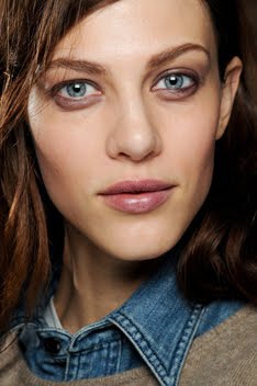
Compare this to the cover with Freja's calm and perhaps mischievous stare, and you're left reeling. Our expectations are turned upside-down and and I feel like this is the larger theme at play here. As fans, we never expected Meisel to work with Freja because we heard all the gossip and knew that they had never done anything together (up until the beginning of this year). We never expected her to land a Vogue Italia cover because it seemed like if she didn't have one by now, she wouldn't be getting one 5 years into her career. We never expected to see her styled femininely again because she seemed to be stuck in the role of the androgynous model. Yet, take a look at where all those "expectations" stand now.
I'd like to think Meisel was aware of all of this, and so it's no coincidence that he choose Freja for this story concept. He's playing with our expectations in real life and within the magazine, and everything is made the better for it. Once you see how perverse and dramatic the story is, the cover comes to mean much more than what you initially thought. It's a cyclical relationship that continues to build upon itself. Just take a look at the cover, then the story, then the cover, and then the story. At least for me, each time I look I see new meaning because the context and how the two components relate to each other create a whole new dimension of possibility.
Another thing I enjoy about this editorial is how kinetic the images seem to be. You can almost feel Mathais' hands around your wrists as he grabs Freja. You can almost hear the discordant notes emanating from the piano as Freja bangs away while Mathias crouches in reproach down below. In each image, you can feel what Freja and Mathias are supposed to be feeling. You see something as powerful as this and you can't help but to draw from your own reserve of similar emotions and experiences. I've always thought that the best images and editorials are the ones that establish a rapport like this with their audience.
This type of editorial is what I live for and look forward to. For me, this is Meisel at his finest. When he sets his work to a cohesive narrative, the results are always electrifying (Side Note: my favorite ed in recent memory is his "Cottage by the Sea" with Katrin and Toni for the Nov08 VI, as seen here and here.) Yes it's beautiful and yes Freja and Mathias are perfectly cast, but the beauty is derived just as much from context and our inferences as it is from the clothes, models and settings.
It also nice to see two mature models who are comfortable and confident in their roles. I do love new girls, but sometimes you just need a veteran to do the job right. And as much as I hate to admit it, I don't think Freja would have been capable of carrying out this editorial at the beginning of her career. I think it really did take a few years of life experience for her to deliver what Meisel wanted from her. Either that, or perhaps I'm just trying to justify why it took so long for this to happen. ;) But Freja is in wonderful form here. She looks utterly natural, alluring and so confident. When she delivers something like this and shows just how versatile she is, I'm reminded of why I started this blog in the first place--to celebrate that in a meaningful manner instead of dwelling on petty matters like her personal life. I hope I'm not in the minority, but to me, her work is far, far more interesting.
I really think that we've only skimmed the surface of what Meisel and Freja are capable of as collaborators, and so I hope with all my heart that they will continue to explore this working relationship. I just have to say how proud I am to be Freja fan right now. She's earned her success and status through steady perseverance and hard work, all on her own terms while staying true to herself, yet still maturing and changing with the years. All of her accomplishments and all that she stands for have really made Freja into a force all her own. And this is a force that can't be resisted....not even by Meisel.
Image Credits: Beautiful scans by tFS member Diciassete (17)!!


10 comments:
Flawless! What a cover of that face! This is a dream editorial shoot! You must have really been happy! I know I am!
Bravo for freja, and for you for taking your time to analyse and putting together this great piece of writing. Freja is indeed beautiful and a source of insparation for many.
Thank you for all ur posts about Freja! She's the best and sexiest model ever! I love her and ur blog as well! <3<3
Besides the fact that Freja and Meisel FINALLY teaming up is just magnificent, I just can't tell you how long I've waited for the Freja/Mathias pairing up. They're a match made in heaven, and I can't at all understand WHY it has taken so long to cast them together.
The fact that they know each other personally and are both danes, just makes the chemistry much better, than if it had been, say Babtiste.
/Caroline
I'm not sure if you've read this or not, but Abbey did an interview with The Times Style magazine and there is an interesting tidbit about Freja in there.
http://forums.thefashionspot.com/showpost.php?p=6813873&postcount=208
Amazing editorial!
juliet xxx
The editorial really is gorgeous, it left me speechless when I first saw it. I do agree with you that it's one of the best Meisel eds since Cottage by the Sea (damn that one was gorgeous)
I like that this editorial follows a story, just like Cottage...
As much as I like this, it kinda reminds me of the ed Lagerfeld did with Freja for Vogue Germany, but there's a big difference btwn both photographers. Like you said, in this one there are more emotions and you can actually feel everything. The Lagerfeld one I felt that as gorgeous as it was, it was devoid of emotions. Love the shot of Mathias under the piano, his expression is just wow really.
They both really have great chemistry and I really hated some comments in tfs that they didn't have chemistry because of her sexuality *eyeroll* (sorry to bring it up)
To sum up LOL, stunning editorial. One of her best really, probably her best.
This editorial is so pretty, so rich, so extravagant. I'm speechless at how beautiful freja is. She seems to be from that era.
Thank you so much for your blog. I get my daily dose of Freja from here. Makes me super happy.
Teresa, I got the Times magazine yesterday. When I read what Abbey had to say it confirmed that she is a complete prick. Some people truly should be seen and not heard.
Did anyone see the video for the photo shoot? Why was Abbey in the video. Was she an option for the shoot too? I hope not....
Post a Comment