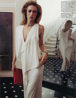
Freja's latest editorial in W magazine is an absolute dream. I love it's updated take on the 1980s style of glamor, opulence and affluence. I love that it features Freja in full glam, feminine mode. I love the great casting of both Freja and Raquel as modern day ladies who lunch and lounge on the Upper East Side of NY. I love the big hair, ostentatious jewelry, fabulous clothes and cheekbones galore that pop out on every page. In fact, there isn't anything that I don't love about this editorial. Every single shot is strong and stunning with both models really emoting and showing all the new girls how it's done.
NY, NY 10021
Ph: Inez and Vinoodh
Styling: Alex White
Other Models: Raquel Zimmerman
Maybe it's the amazing sets with their extreme attention to detail, but to me this editorial looks like a beautiful tableau vivant. I keep waiting to see Freja or Raquel move on the page. I haven't been this enthralled with an editorial and it's complete vision in a very long time.
This is such a difference from the last time Inez and Vinoodh shot Freja and Raquel for W Magazine. Thank god Freja isn't treated like a background prop again. I only wish we had at least one shot of her and Raquel together so we could see them play off each others strengths and show us some really interesting contrasts. It's not often that you get two veteran models of their caliber working together, so it would have been really nice.
Speaking of, I'll never understand why people feel the need to say that so-and-so outshines so-and-so whenever there is more than one model in an editorial. Is it insecurity that elicits the need to put down one in the effort to prop up the other? I just don't get it. Perhaps I'm too PC. What I do understand is that is really doesn't get any better than Freja and Raquel shot by Inez and Vinoodh. Think about it. That's years worth of modeling and photography experience coming together in one editorial. How could it not be good? As much as I loved Freja's VI ed with Mathias, this one has to be my favorite of the year hands down. I knew from the moment I first saw it.
I always thought Freja had a little bit of that 80's era opulence in her look, and when styled in this manner you can definitely see it. The last shot is especially wonderful with Freja looking so feminine, playful and wistful. It's the perfect shot to end a beautiful story, and it's the kind of image that really displays the model who I've always known Freja to be. I'm just so happy that this year has finally brought that out again after we all had to dwell in the androgynous doldrums for so long.
You know you've just seen a good editorial when you're utterly disappointed to come to it's last image. And this might even be the last time that we'll get to see something like this, for there are major changes afoot at W Magazine. Changes that could result in major staff leaving the magazine, including Alex White who styled this editorial. I know that W isn't always the greatest when it comes to content and covers, but I feel like it's really the only mainstream American magazine that consistently runs editorials like this one and I would hate to see that change. Stefano Tonchi, now that you're the new editor-in-chief, I beg of you: give us more models and stunning eds, and less egregiously photoshopped celebrities please! Although, things are already looking bad for us fashion lovers. Blah!
Image Credits: My scans
Wednesday, March 24, 2010
Subscribe to:
Post Comments (Atom)


6 comments:
are you a MAC or PC? lol...... i agree this is a stunning editorial bot models are great and they leave you wanting more
Oh I'm so getting this W. The editorial is stunning, I love the second picture with Freja wearing the Valentino gown. So feminine.
And oh, not trying to nitpick or anything but you misspelled "Glamour" on the title of your post. You put "Glamor"
*blushes*
^There are two ways of spelling the word. I guess it depends on where you come from. It's like color and colour. :)
Oh sh!t...I knew that...lol
Sorry -blushes-
I guess you learn something new everyday.
But anyway, that editorial is A++.
Okay. I'm really glad I subscribed to W magazine. I got my April issue a few days ago and was sufficiently pleased (and maybe surprised) to see that there was an editorial shot by Inez & Vinoodh (lovely) featuring Freja and Raquel.
I have to say that although I first encountered and started favoring Freja when she was still portrayed in an androgynous way and thus find it a bit difficult to see that her image is changing, I rather really like the the styling in this ed. I might sound like an idiot, but it reminds me of the Oscar de la Renta look, which I loved.
@Miranda: I guess we're opposites then. ;) I started liking the feminine side of her first, before she started going all andro. But that's the beauty of a model like Freja....she attracts a wide variety of people for different reasons. Truly the mark of a great model who can be all things to all people.
Post a Comment