Shrink to Fit
Vogue Italia April 2010
Ph: Steven Meisel
Styling: Karl Templer
Other Models: Abbey Lee Kershaw, Amber Valletta, Angela Lindvall, Geidre Dukauskaite, Gwen Loos, Monika "Jac" Jagaciak, Joan Smalls, Lara Stone
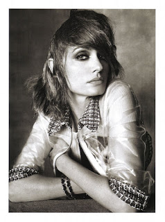
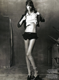
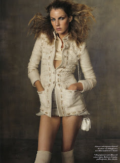
Here is an editorial where the concept and casting completely win me over. In what could have been a predictable and boring studio edit, Vogue Italia and Meisel give us something quite enchanting, whimsical and beautiful. The idea of doing a shoot where the clothes are too small, even for the models, is hilariously ironic. Perhaps a slight nod to the model size debate that seems to wage on endlessly without accomplishing any sort of institutional or ideological change?
If you've been following along, all the different camps like to point their fingers of blame at each other with no one group willing to take on even the slightest bit of responsibility. Designers say that agencies send them girls who are too thin. Agencies say that designers make sample clothes so tiny that they need thinner and thinner girls to fit into them. Both say that the general public does not want to see bigger girls in magazines and advertisements; for fashion is about fantasy and aspiration, and not reality and the truth. Who's to blame? Everyone? No one? Me? You?
I feel like Meisel is kind of thumbing his nose at the whole issue here, poking fun of things in a subtle but subversive way. Ok, so maybe "thumbing his nose" isn't the right phrase. Whatever he's doing, I feel like he's trying to say something about the debate, but I'm just not sure what. Or perhaps he was merely inspired by the debate and took it as a jumping off point for this story. Regardless, when I see this editorial in its entirety, I start thinking about the eternal conundrum, "what came first, the chicken or the egg?" Or in this case, "what came first, thin models or small sample sizes?" Try wrapping your head around that one.
At first glance, this editorial looks very similar to the one Meisel did for the March issue of Vogue US (also featuring Freja). Same studio setup and plain, drab background. But upon further inspection you begin to notice that the two stories couldn't be more dissimilar. The execution and underlying motivation of each really shows you how different Vogue US and Vogue Italia really are as publications in terms of creative freedom and expressive risk-taking. One's purpose is to showcase clothes for general mass consumption. The other's is to contribute to a larger, relevant fashion discourse and make you see and think about clothes in a new way. Amazing how all the same elements can result in such two different outcomes, for the context and the words "US" and "Italia" really do have that much of an impact on what an editorial by Meisel will look like.
Anyway, I really do enjoy the casting here. It's a little bit unpredictable, but at the same time it feels comfortable. I like seeing new girls get their chance, and if any older model needs a comeback it's definitely Amber. The styling is rather ingenious with no detail overlooked, even down to the models' too small shoes. (In Freja's last shot you can see her heel jutting out over the edge of her loafer. So brilliant.) I know that the hair styles have gotten a lot of flack and most people find them to be too distracting. But for me, the hair contributes another degree of charm to the whole story. I can just picture all the models getting pushed into the wash, and here they have all just emerged with their hair wet and disheveled, and their clothes shrunk.
Kind of makes you wonder, what size are those clothes if they look too small even for models? Quadruple zero? Size negative (does that even exist) ? Just another testament to the great styling and an overall great editorial concept. These images might not strike most people as being beautiful, but that doesn't mean that they aren't. For me they posses a beauty that goes beyond surface appearances down to ideas and the intellectual statement. And the way they challenge conventional fashion norms is also a beauty in and of itself.
Agree? Disagree? Did you get another reading? Let me hear it! :)
Image Credits: Scanned by tFS member Diciassette (17) @ tFS
Subscribe to:
Post Comments (Atom)


9 comments:
i'm sorry but that all sounds like bunch of contrived pseudo-intellectual bullshit. aside of the brilliant styling by Karl this editorial fails on all four corners.as for the HAIR! it's like something that the toilet backed up.
@SF: I thank you for always taking the time to read and comment. But what's contrived bullshit to you takes a lot of time, thought and effort for me. Please be a little more respectful of that in the future. If you have a problem with this blog and the way I run it, I welcome you to send me an e-mail with some constructive criticism. Otherwise, I welcome you to share some insightful, substantive thoughts as to why you don't like the ed, or why you disagree with my reading of it, in this comment section. Thanks.
i personally love your insightful views of the latest freja editorials you do a great job.
as for the ed it's not my favorite but i love freja and meisel so i'll let it slide:)
I saw this editorial about 2 days ago and I really hated the hair. But now that I have seen it more, it has grown on me. But I am not loving all the Freja pictures, watching that video you posted earlier, I think there has to be better ones. Oh, well, there will always be a next one. The portrait of Abbey is goregous though.
Also, have you seen the Freja interview at Fendi?
http://www.youtube.com/watch?v=E3TwW3qooj8
By reading your analysis I have come to hate the hair less haha.
As to what size the clothes are, I think they may have pinned normal sample size clothes back with large clips (the video shows this) to make them look tiny. As for some of the vests, maybe they had to resort to children's sizes!
I like the concept, it was very well executed. And when you put it in context of the ongoing weight debate, it makes even more sense. I was a bit confused by the ill-fitting clothes initially. As far as the hair goes, I am not very keen on it. It works for some models better than others: Lara, for example. Yet it's a very interesting and makes sense. A+ analysis.
Another great post so nice to hear insightful comment and thought rather than the endless fangirl emoticons. you are a very talented writer.
Post a Comment