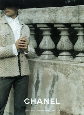
As much as I'm all for embracing technology and progressing with the times, there is really something to be said for traditional ways of viewing. As I was flipping through the current issue of US Vogue, Freja's Chanel ad really popped out at me.
I know it's kind of ironic that I'm using this digital scan to convey to you what a beautiful impression this image is on the the actual print page, but oh well. You gotta work within the limitations of what you're given, right? Anyway, this image is so much more dynamic and elegant on the page than it is on the screen. In fact, when I saw it I thought it was a new one that we hadn't seen yet because it looked so unfamiliar. I had to go back and double check that it had indeed been released. Freja looks so alluring, and the composition and perspective of the shot really enhance her and the clothing.
I think we tend to forget that the way we view things imparts much more meaning into images than we realize. Nowadays we see ads on the internet before we see them in magazines. We make our judgments based on what we see and move on to the next thing in this hyper active, image parade of a world in which we live. We are incessantly bombarded with things and we can just gloss over them without really absorbing anything. Case in point: when I didn't recognize this Chanel ad. Since much advertising money is still with print, most ads are still created with that medium in mind (this season's Balenciaga campaign being a prime example). So I guess what I'm trying to say is that we should think (and look) twice before we write something off, especially if we're seeing it online first.
As for the larger topic on hand, I don't think it has to be one way or the other. I don't think we have to give up print for online. With enough time, innovation and creativity, I think the two mediums can perfectly co-exist, and even bolster each other. Each one filling in the shortcomings of the other. They provide such different experiences and satisfy different needs that it would be a shame to lose one. So why can't we just have the best of both? I don't know...maybe I'm just a tad old school. :)
Image Credits: my scans
Thursday, February 4, 2010
Subscribe to:
Post Comments (Atom)


7 comments:
I can't imagine life without magazines, there's just something about the smell and feel of them. I have hundreds all filed in boxes under my bed.
It's like the book will never give way to audiobooks or those little e-reader things, so a magazine should not give in to the internet.
I love this ad, I really want the print in my next Vogue.
x.
Thanks for share this, I just have small pictures of the campaign.
Sadly, there's no chance to find a chanel campaigne in magazines of my country, at least I have this.
I'm so in love with how freja looks in this shoot. And she made a really good work with the clothes, the expresions and baptiste. Like always.
Amazing Blog, I LOVE Freja!
this image of freja is really captivating... you should consider it as a new banner for the top of your blog. just throwing out there.
^ i second that.
i remember disliking a lot of images from last FW09 ads and they turned out lovely on paper. and no matter how thankful i am for scans nothing beats seeing the actual thing in print.
lol, I get it. the banner is old and ugly. It's on my list of things to do once i get a better understanding of photoshop. But I kind of like those old school pics of Freja. They're quite nostalgic...
You could make a contest and let your readers design a banner. I'm sure the results will be good.
Old post, but I just wanted to say that I love how you write and appreciate your insights.
Post a Comment