Monday, June 29, 2009
Chanel!
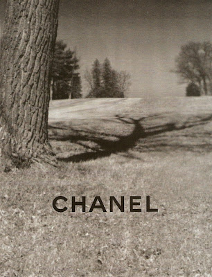
The first images for the Chanel campaign have arrived. A very large thank you is owed to tFS member Northern Star for scanning and posting the images. (If you're a member of tFS please remember to give him karma and/or say thanks.)
I literally gasped from surprise when I first saw the images. They're not what I was expecting at all after seeing the runway collection, but that isn't a bad thing. In fact, I'm happy to be caught off guard by Karl. I usually find his photography and concepts somewhat predictable and staid. But I think this concept is a departure for him.
It's quite difficult to determine what an entire campaign will end up looking like based on two images, but I think we have a good feel for things to come. What I'm most surprised about is the way the images appear to be from very old albums. There is a sepia tone effect; and that combined with the outdoor setting makes the images seem like snapshots of the American Old West.
Consequently, this causes a very interesting juxtaposition. If you can recall, the collection had many aspects of modernity and technology front and center. Most notably, these bags designed with compartments for your iPod, earphones and anything else you would need as a modern woman. The bag addresses the needs of today, yet the campaign images hark back to an bygone era. I don't really know what this means if anything but it's intriguing nonetheless.
I also wonder if there will be narrative development throughout the rest of the images? What's the story behind these two women? Why are they in such an embrace? Is Heidi exhibiting signs of Puritan restraint by keeping her hands in her pockets? I also get that Puritan vibe from the high, buttoned up collars and long skirts. And since we're dealing with two women I get a Children's Hour vibe as well. The Children's Hour is a famous play set at an all-girls boarding school in the 1930s. Two of the headmistresses are accused of having a lesbian affair and a lot of drama and tragedy ensue.
Goodness, as I think about it more there seem to be so many references contributing to these images. So far, I get the American Old West, Puritanism and the Children's Hour. But that could just be me and my tendency to over analyze. I really hope we get some sounds bytes or quotes from Karl citing his inspirations for this campaign. Any other thoughts out there? Do you see some obvious references that I miss?
One last thing I noticed right off the bat....this is the first ad campaign to so strikingly address the speculation around Freja's sexuality. She's locked in an embrace of questionable nature with another woman, and this is at the forefront of the image in a major label campaign. Are the other images going to address this as well? Is this why Karl went back to Freja for this campaign? Or maybe this reading is too colored by my prior assumptions so I'm seeing something that isn't necessarily there?
So many questions. I'll be able to edit down my thoughts as more images are released, which will hopefully be soon!
Image Credits: Scanned by tFS member Northern Star, style.com
Subscribe to:
Post Comments (Atom)


8 comments:
Looks great so far. BUT what the hell is wrong with Heidi's expression, it seems off.
Those plastic bags are so hideous.
i like both shots so far(even Heidi's guarded expression) it has a somber tone to it.and it was shot in my home state! go VERMONT :)
I actually screamed when I saw these on tfs, they are amazing, no at all what I was expecting! :)
I almost fell off my seat when I saw these, yes, this ad is exquisite the b/w old picture, amish/victorian whatever kind of feel to it, but that's not what piqued my interest but the choice of the theme/plot.
I know this is not the first major label to use the same scenario but considering that Freja is starring in the campaign makes it really intriguing indeed. I also have the same question as to what or who is his inspiration for this campaign. I read somewhere that tattoos is one of his inspiration for SS09, of course Freja nabbed the campaign and the pistol-heeled shoes of resort 2009 was also rumoured to be inspired by Freja's gun tattoo so maybe she's also the inspiration for this new ad, I could be wrong though.
Anyway, I'm really happy to see Freja doing Chanel ads again, I honestly believe all this talk about Karl sort of falling out with Freja the previous seasons does not really makes sense, when she missed SS08 she came back closing the pre-fall show, SS09 we know what happened, she appeared at the mobile art exhibit and his own line ad campaign , HC show etc. and now back to Chanel. I think Freja has always been his favorite.
PS : Sorry I didn't realize it was so long.
No worries. I love long comments. :) I think you're right...Freja has always been a favorite of Karl's. When she wasn't walking his shows I think that had more to do with her own personal issues rather than with anything going on between Freja and Karl. But I guess as Freja fans we have a tendency to overreact.
http://i596.photobucket.com/albums/tt44/zeeakawanted/Gucci%20FW%200910%20AC/3.jpg
i haven't seen it here.. so i thought i could try to suggest this pic from gucci fw campaign
++
http://i596.photobucket.com/albums/tt44/zeeakawanted/Gucci%20FW%200910%20AC/2.jpg
Post a Comment