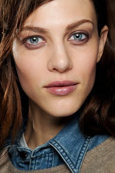
Freja's new editorial in V Magazine is such a breath of fresh air. If you're tired of jumping editorials shot in the studio against a gray background, this is your antidote. The antithesis of any editorial you will find in US Vogue. Full of creativity, fun, whimsy, and spontaneity thanks in large part to the work of stylist Jane How (pictured above).
Sorrenti is a great photographer in his own right, but I really think the clothes make this editorial and we have Jane's ingenuity to thank for that. She frequently styles runway shows for Maison Martin Margiela (she was responsible for the infamous collection shown on life-sized marionettes operated by actual puppeteers.) In addition to working for Margiela, Jane has acted as creative director for Hussein Chalayan, another avantgarde designer who relies more on artistic sensibility rather than commercialism when designing his clothes. One of her earliest jobs was styling for i-D Magazine so you can see a common thread in that Jane aligns herself with the cutting edge of fashion. She works on this edge, right where fashion begins to intersect with art and her stylistic approach absolutely reflects this. She has a flair for the dramatic and isn't afraid to be innovative, pulling looks from less well-known designers.
The outfits she pulls are quite simple and straight forward, but her ability to combine pieces is what makes this editorial so memorable. She has used all the right looks from the right designers in order to evoke a sense of awe and wonder, comparable to the awe and wonder you feel when standing in the middle of New York's Times Square. However, the clothes and accessories are perfectly edited with Jane's great eye so you don't feel completely overwhelmed. And they hold their own against the strong city landscape, resulting in a nice dialogue. The architecture of the buildings and the clothes play off of each other, enhancing each other in the process. The whole thing is quite subversive and that's why I think it's so brilliant.
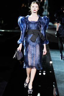
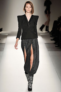
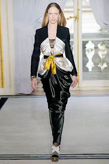
It is always interesting to see how runway looks are interpreted by stylists in the pages of magazines. I have a particularly hard time envisioning how an outfit will look off the runway, which is why I love editorials set in the streets so much. I know they're not exactly good representations of reality, but they give my imagination fodder and I can begin to see the versatility, wearability and transformative power of the designs. Take a look at the editorial versus the runway and I think you'll appreciate the beauty of the editorial and Jane's styling even more.
After looking at these runway looks, I really wish this editorial had been in color. The contrast between the glamor of the clothing and grittiness of the city would have been more apparent and stark. But maybe this was intentional? The b&w photography and shallow depth of field blends all the elements of the photographs together. As a result, you really have to look to see everything because the distinctions between background, foreground, models and buildings almost become obsolete. And for a shoot like this, you definitely need veteran models at the top of their game. Newer girls would have been engulfed by the clothes, setting and shooting style. But Freja and Sasha are two of the strongest models, both in personality and look.
There is so much more to say about this editorial, but I think I've said enough. Overall, I really think everyone delivered on all aspects, and I haven't been this excited to see something in print in a long time.
Image Credits: i-dmagazine.com, style.com, catwalkgenius.blogware.com, runway.blogs.nytimes.com, vmagazine.com via tFS member TERRYWORLD
Subscribe to:
Post Comments (Atom)


3 comments:
great post!
Hey i love your blog. great insights. :)
Thanks to the both of you for your comments! :)
Post a Comment