Generally I like the use of shadows in photography because I think they can bring great contrast and complexity to images. Here, the shadows are overwhelming and distracting. They are too opaque and I find myself straining to look past them at the clothes. Needless to say, I'm not really a fan of this campaign.
These days it has been very quiet on Freja front. We haven't had any news other than the upcoming Chanel campaign, which is why my excitement level is very high. We know it was shot up in Vermont at Karl's new home. I just wonder how different the ads will be compared to last seasons', also shot up in Vermont. Will Karl employ the same strategy as he did for SS07 and FW0708 and turn out two diametrically opposed campaigns in terms of appearance? Guess we'll just have to wait and see!
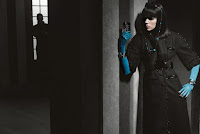


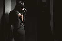


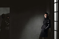


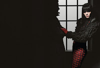

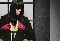


Image Credits: Freja's thread at tFS




1 comment:
AHAHA! this is the look that collison girl is trying to channel. sorry kinga and meghan, but there could only be one Freja.
great blog BTW.
Post a Comment