
Vogue-à-Porter
Vogue Paris February 2010
Ph: Inez and Vinoodh


This is a beautifully shot and composed editorial, and it's something I can get excited about. It's both visually stunning and intellectually stimulating. When you look at this, you can see more than just the clothes, models and setting. You can see and feel a subjective social voice behind it as well. Maybe it's just me and my tendency to over analyze things, but I see an appropriation of the Middle East going back in the tradition of Edward Said and his concept of Orientalism. The clothes are all current yet the setting is devoid of any reference to modern times or technology making the differences (whether actual or merely perceived) between our western world and this eastern one even more stark. There is also a play on the now pervasive tourist snapshot that captures out of place people in extraordinary locations. The collision between western and eastern fashion norms is also apparent in the diaphanous discord between covering up and revealing the skin. There is also the idea of male desire and the male gaze, made even more poignant when one understands the history and role of the harem in middle east culture. These are just some of the thoughts that came to my mind, but I will not expound upon them for fear of boring you (although that's probably too late).
Anyway, I don't believe this is your typical east meets west fashion editorial. There is something different about it and this is what interests me. The setting is far from glamorized. There are no sweeping landscapes or gorgeous vistas. In short, this isn't a travel magazine spread like fashion eds sometimes can be. So I guess I'm left with a feeling of unease after seeing all the images. This isn't a bad thing at all, but I just get an ominous feeling from the confluence of all the elements in this editorial. Something is very unsettling in the way the images are cropped and composed. It's like I want to see more, but I physically can't. Nevertheless, this is just my own reading which is undoubtedly influenced by my limited knowledge of the current situations in Iraq and Afghanistan.
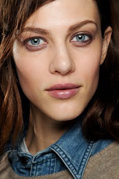
Moving along, Freja looks to be at the top of her game. She's working well with both Lara and Dree, yet she's able to stand out in certain shots. You can feel her glare jumping off the page and straight into your own eyes. It's just so refreshing to see her in something where she doesn't come across as passive, bored or uninvested. The rest of the editorial is quite interesting too. There appear to be three fashion stories going on simultaneously. Although I wonder, why were all the shots pushed together in one big editorial? Why not just have three separate pieces? If you look at each story individually there is enough narrative and cohesion that they stand on their own: Freja, Lara and Dree's shots being one, Daria's being another and the studio shots being the third. Interesting choice by the VP team.
Daria:


Studio:


Your thoughts, comments, insights, criticisms? I'm interested in hearing what other fans think beyond the fact that Freja looks good.
Image Credits: Angelscans and tFS member AngelLover


11 comments:
I like Freja in the editorial but the whole "people as props" thing going on in the Daria ed, that seems to occur so much in non-western fashion editorials, is a bit dehumanizing.It makes me uncomfortable.
Happy to see a different side to Freja though.
I absolutely feel the same way. It surprises me sometimes how pervasive exploitation still is in the industry. Not just with different cultures, but also with young models. But this is an entirely different subject not appropriate for this small space or blog...but this doesn't mean I'm naive and unaware about all the negatives.
i actually think the old man is quite charming, he seems more active in the ed than a prop like the people in freja's ed, with their "omg who are these people?" look.
I think Freja is sort of the "leader of the gang" in the editorial, which is why I am drawn to look at her first.
And as always, Daria looks beautiful, especially in the Loewe cape.
Love reading your thoughts, it's always nice toread anotehr's perspective on something.
x.
Daria's editorial more acceptable to me than the other "model in exotic/third world/foreign" land theme that Vogue tends to churn out so often. Freja's editorial veer into that territory. However, their focus this time seems to be on seamlessly blending the models with their surrounding as opposed to contrasting the difference between the natives and the models. IDK if that makes sense.
^It makes sense to me. :) I'm interested to hear why Daria's is more acceptable to you than Freja's part. It was kind of the opposite for me.
Was that Tanga Moreau in the studio editorial? LOVE her. Fingers crossed I'll more of her again.
Very impressing shooting. I do love daria's ed which is strong but at the same time romantic. The dresses are light as the wind and give the idea of freedom. Nevertheless I would have made the beduin interact more with daria or made him appear mr shocked by such beauty in a desolate place such as desert.
But I adore even mr freja's ed. It's very strong and magnetic. In my opinion there're some reminiscences with pasolini's film"Medea":the colours, the clothes, the facial expressions,..
everything starts very softly to end with a victorious image.In the last pic they look like aliens.They have found the bravery to grow away from arabic categorical customs to adopt a mr free way to express themselves.
truly beautiful, i guess this ed will be one of my faves in 2010. i love it how consistent the images are and the story they show.
freja looks fantastic, but daria owns the ed, i'm so impressed by her pictures. amazing
i obviously meant daria owned the issue ;)
I have to agree with kunklebunkle in that Daria's editorial seems to be a girl who has developed a certain camaraderie with the man in her editorial. I love the interaction between the two of them. My favorite shots are when they're walking together, he's holding her, or watching her from a distance. I wish Vogue Paris had kept the intimacy (not sexual)of the editorial rather than have Daria shouting or posing so hard. I appreciate the editorial so much more when she's sensual. There's a certain ease about that. It speaks to their relationship so much more.
The Freja ed is so gorgeous! I love the movement and the drama in the body language and I love how rather than having the 3 of them shy away from their environment, or have this cheesy enchantment with their surroundings, they're just owning it. In every single shot. Gorgeous styling, gorgeous modeling and breathtaking photography.
Post a Comment