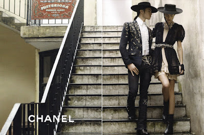
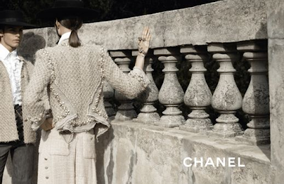
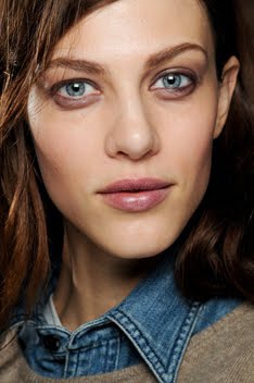
More Chanel ad campaign pictures have leaked.
One thing I can say for sure is that I'm happy Freja is more prominently featured this time around with a few solo shots. Last season she was clearly playing second-fiddle to Heidi Mount. I thought it would be the same for this season when I heard Claudia would star as well. I was afraid Freja was going to be relegated to the back, essentially becoming the female equivalent of Baptiste (formerly Brad Kroenig) i.e. written off merely as one of Karl's favs.
Not all the images have been released and we probably won't see the whole set (eyewear, accessories) until much later, but things look good albeit a tad straightforward for my taste. There doesn't seem to be as much to analyze and grab your attention like there was in last season's first campaign image saturated with Victorian, lesbian undertones. Nevertheless, this campaign is aesthetically satisfying and Freja looks beautiful.
I'm always surprised at how well she fits the current Chanel image. Especially because I've traditionally associated the brand with an older woman (blame it on the pervasive tweed and the way Chanel No. 5 smells like an old lady), yet Freja is so young and edgy. Goes to show you that sometimes the unexpected works out better than you could have ever hoped for. The location is gorgeous too. And I really like how the grittiness and history of Buenos Aires contrasts with the glamor of the clothes.
Your thoughts? Do you like it? Hate it? Unless the rest of the images are completely and surprisingly wonderful, I feel neutral towards this campaign overall. It's nice looking and I'm glad Freja's in it and getting more exposure, but it's kind of boring. Maybe I was just expecting more considering the show we got on the runway...although, I can see how it would be pretty hard to top that.
Image Credits: scans by bwgreyscale member fearless123, lebook.com via tFS member ThiagoMello
Thursday, January 7, 2010
Subscribe to:
Post Comments (Atom)


7 comments:
OMG!!! Gorgeous!
I think this Chanel ed is better than the last one, it seems to catch the mood of the collection a lot better and i quite like that karl tuned the whole peasant-vibe down a bit to make it more to a tipically pride-filled argentinian gaucho environment.
Did you see the news about the next Vogue Italia? A 80 pages editorial and Freja is in it, i guess she's officially an accepted Meisel-girl. I can't believe it !
Thanks for maintaining this blog, i really love your writing.
Yeah, I saw the news about VI! The world seems turned up side down on it's head...I still can't believe she's actually working with Meisel now. But both eds have been huge multi-girl ones. So maybe I won't believe they're actually working together until she get a VI cover. ;)
I think its a step down from the fw09 campaign just because this is so blunt. There isn't really a story in these pictures as there was last season. That being said I do like this more than I did after seeing the initial pictures, especially the second picture from the lebook.com set ... by the way, you probably already know but I'm surprised again that Freja is in another Meisel/VI editorial! I can't wait to see the results.
Also, great job on this blog I always look forward to your new posts :)
^Thanks for reading Tinsley. :) And keep up the great work on your Daria blog!
i like it to be honest.it's pleasant to look at.
I love this, especially the last shot, although I did like last season's aswell.
I saw one of the Claudia solo shots, and thought "oh no, Freja is the new Baptiste!!" but these have proved me wrong, they're beautiful.
x.
Post a Comment