If you're going to do androgyny, this is how to do it. Androgyny doesn't always have to rely on tough styling, scowls, leather biker jackets, and other overtly masculine signifiers. Editors don't have to hit us over the head with these types of references. Besides, true androgyny should be able to stand on it's own, separate from masculine and feminine aides.
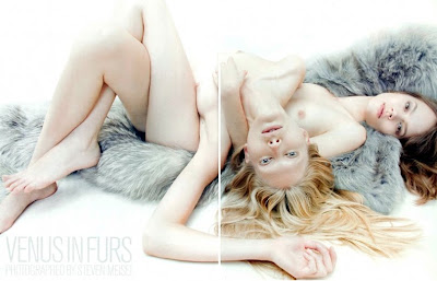
Venus In Furs
Vogue Italia November 2010
Ph: Steven Meisel
Styling: Karl Templer
Other Models: Alla Kostromicheva, Andrej Pejic, Iris Strubegger, Iselin Steiro, Michael Tintiuc, Tomek Szczukiecki
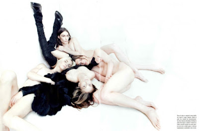
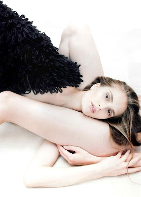
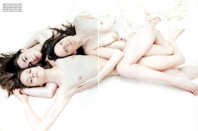
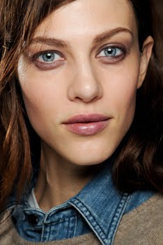
This editorial is the perfect example of that, and it's the first time I don't mind Freja being lumped in under the androgynous category. The pared down, natural appearance of each model is allowed to shine, and this minimalistic approach is quite successful at getting down to the essence of what makes each person androgynous. When the models all look so similar, when they're all in skewed positions with limbs akimbo, and when they're allowed to interact and play off of each other, the line truly becomes blurred between male/female and feminine/masculine. A person who doesn't know who these models are would have a very difficult time discerning between the women and the men. And that is the true definition of androgyny: being neither distinguishably male nor distinguishably female.
I really feel like this is the first editorial where I've been able to truly see and appreciate both the feminine and masculine aspects of Freja's face, and indeed all the other models' faces as well. From shot to shot Freja looks different, and that's what a good photographer can do. A good photographer doesn't have to rely on tropes or stereotypes to make a point. A good photographer smashes those things, and gets down to the basic essence of it all. There is nothing signaling to us the viewer, telling us that we should see these models in a particular way. So now it's up to us individually to see what genders and gender signifiers we want to see. This openness is what I appreciate and what allows me to see these models both in new ways and in ways they're usually meant to be seen.
Another thing I love about this editorial is how the models and the fashion don't seem to overshadow each other. Since I'm interested in models more than fashion, I have a tendency to overlook the fashion sometimes. But in this editorial the lack of clothing enhances the fashion for me, ironically enough. I find myself paying as much attention to the fur and leather as I do to the models. Models and clothes are working in tandem to create one huge, glorious bacchanal of bodies. And now that I think about it, it's so fitting that in a fashion story about fur and leather, the models should all be in their own natural skins. Another brilliant and subtly obvious touch. Obvious because you immediately see the raw nakedness of the bodies. But subtle because it takes you a minute to realize that the only thing being featured here is skin, be it animal or human. It's a little creepy when you think about it that way, for it's quite literally skin on skin in more ways than one (especially when the bodies are piled on top of each other). But that's classic Meisel. Even when things seem pretty straightforward, there's always an off kilter element underlying the simplicity. And considering the fact that there are so many naked to nearly naked bodies intertwined together, this story doesn't feel particularly sexual to me. It's more desexualized since gender is wiped away, and this gives us the freedom to appreciate the clothes and the bodies for what they are. It's funny how something that seems so overtly sexual at first, can become the opposite with a deeper glance.....at least for me.
These eccentricities and complexities are what distinguishes between the good, and the great. I don't know if this editorial and cover will stand the test of time, but what I do know is that it's the first piece of work that's made me excited again. The second I saw the cover, even before I saw this editorial, I knew I just had to have this. I think the last time I felt this way was with Freja's last VI cover, so I guess there's a theme here. Anyway, I just have to remember that this is what it feels like when things are great. When we don't have to settle for mediocrity. When we don't have to strain to find nice things to say just so we can be diplomatic. It's comforting to know I can have this instantaneous and unbridled reaction of excitement again.
Image Credits: zfashionblog.wordpress.com
Subscribe to:
Post Comments (Atom)










16 comments:
I agree with you here, ambiguity is what gets lost in recent androgyny edits.The clothing, the lighting and innocence of it all is just amazing.
Oh and it's good to be back! :D As always, you're doing a wonderful job with the blog.
Lol, I really don't understand your extreme dislike of "a certain type of androgyny." But I guess we all have our preferences. Sure Freja had a point in her career where she was the go to androgynous girl but I never saw that as a bad thing. Besides even during that phase she showed variety in her work. You just seem to be fiercely opposed to Freja being portrayed as anything but feminine and I find it kind of odd. Maybe you're projecting your personal ideas of what it means to be a woman onto her? Despite this I still find your blog very insightful and beautifully written.
Anyway, I really like this ed. Everything seems to be warm and inviting despite the chaos of their limbs.
HOLA..
ESTO ES UN EDITORIAL PARA AMAR
No hay palabras para describir lo hermoso del Editorial... Esto es sinonimo de una PINTURA MANIERISTA(Italia 1525-1600)...
Cada personaje(modelo) en la obra sufre tremendas distorsiones en su anatomia, posturas complicadas e incomodas... Pero reflejando en sus rostros de porcelana blanca cierta delicadeza, inocencia, serenidad y encanto...
Una perfecta sintesis geometrica del espacio y las formas...:-)
Aplausos para Steven Meisel...y por tu grandioso trabajo en el Blog...:-)
i don't know, i think i just don't feel it.
i find some photographs very soft and almost beautiful (they actually remind me of some paintings: complicated postures of the body, angelic face), but again, i have no idea why this all seem so cold to me. quite posed, quite forced.
great cast, though.
@ SF: I think you just beautifully said in one sentence what it took an entire paragraph for me to say...LOL. Ambiguity is exactly what I was getting at.
@ anonymous @ 5:35: Not so much fiercely opposed, but more like extremely tired and weary of. That time when she was the go-to androgynous girl also coincided with the low point of her career, so perhaps I'm unfairly associating that type of androgyny with failure? But definitely not projecting what it means to be a woman onto her, because being a woman isn't just about looking like one. I'm just trying to show that Freja is a better, more multi-faceted model than people give her credit for.
I don't know how long you've been following Freja's work, but I get the sense that newer fans don't understand this because they weren't around to experience the earlier days, and then the subsequent disappointing lull in her career. I've talked to some older fans and they can commiserate with the way I feel. Of course, this is just a generalization based on my limited experience in talking with other fans. It could just be a few of us who feel this way. I just happened to have this blog on which I can voice my feelings so I'm lucky. :)
@ anonymous @ 5:55: I love your comparison of this ed to a Mannerist painting! Wish I had thought of that myself...lol.
"I'm just trying to show that Freja is a better, more multi-faceted model than people give her credit for."
Fair enough. But would you also have grown "tired and weary" of Freja if she were portrayed in a feminine manner? Like most of her counterparts.
I'm not a newer fan either. I just don't see what you're seeing. But I suppose it's a good thing that not everyone thinks the same things.
There are a million things I could say about this here, but I think I'll get off my lazy ass and make my own post... In a nutshell though: this is truly 'Beauty in Vogue'.
@ anonymous @ 8:21: Oh absolutely without a doubt! I have stopped following many model's careers because they were/are pigeonholed into one role. But I don't run blogs on them so of course no one knows. :) I just have to be vocal about Freja because I happen to run this blog. I've mentioned Lara on here in passing a few times, but she isn't really a fav even though I do respect her. With her I can imagine that some of her fans are tired and weary of her always being portrayed in the same way. I know I'm bored of her as the sexy, vamp. (I'd actually love to see her switch roles with Freja and take on a toughness.) Some people think I have a thing against masculine/androgynous styling, but it's really just a thing against staleness and hackneyed concepts. Which is why I love this editorial so much....it's something different, new and fresh. And yes its a very good thing that we all have different opinions. Enjoyed hearing yours very much!
@ Gill: Can't wait to read it!
I really love this editorial - thank you, Vogue Italia and Steven Meisel. This is a prime example of why I enjoy the European publications of Vogue so much - you can have the pleasure of seeing photographs such as these. I agree with you, Rose, re: the fashion in this ed. I found myself really noticing the boots, the jackets and gloves - almost more than I usually do in a typically "clothed styled" editorial.
Also, even though everything is posed, there is a certain beauty and languidness to all of the photos with the stark set and the pervasive ambiguity. This ed beckons for repeated viewings and that, in and of itself, proves it's success. I am looking forward to actually seeing this on the page.
I think Freja's body of work for 2010 solidifies her multi-dimensionality as a model who is at the top of her game. Keep the editorials and the campaigns coming - the year isn't over yet! :)
"And yes its a very good thing that we all have different opinions. Enjoyed hearing yours very much!"
Yes it is, and thank you for being so cordial.
I agree about Lara and her sexy vamp with exposed tits look. Stale indeed.
Anyway, I think I've bothered you enough for now so bye!
i'll be honest here..i totally appreciate everything being said and the idea is cool and all, and although i would definitely have liked it more if it was ALL Freja...i still don't really like it. while still liking it.
for a while, i've been feeling like fashion is showing too much breasts and less clothes. Vogue especially, with it's lack of actual editorials and so much other bullshit instead as it is, should at least feature more clothes and styling for us too see and be inspired by.
and although i am also more interested in Models more than the actual clothes, i just feel like the breast has become an accessory. just thrown in. like 'why dont we just pull down this top and show a boob?'. i guess here, it does have it's place, with the ideas of adrogyny which i think works really well, but at the same time, i don't think it really needs to be there. all the models could've been fully clothed instead and the editorial expolring the facial features rather than anatomy, which here just highlights rather flat chests, which generally isn't even an issue really, but in this case was abit too easy. Especially with Freja as i feel like it's something fashion seems to do to her alot. i dunno...
this VI ed kicks a$$ over the both the new VP eds combined!!!
there is a short video of freja on style.com http://www.style.com/video/fashion-moments/fashion-moments/1896809784/freja-beha-erichsen/656386262001
While I love Freja's own style of androgyny with her biker boots and jacket, I do think photographers can go overboard with it. This editorial is so perfect and what I love about it is the innocence. You hit the nail on the head there. It's so playful, yet in a really non-sexualized way. I love how they all look like rock n roll/hippy nymphs (to me). Thanks for again being the first to bring this to my attention. Running to get my copy! :)
http://rightjr.blogspot.com/
Oh my god. This is incredible. I'm especially in love with Iselin's shots. She and Freja are my favorite models. The shot of her and Freja is just beautiful.
Great analysis, Rrose! I did find myself going back for repeat viewings. The styling is perfect -- not understated but not too much (which tends to happen with fur stuff -- Vogue Russia is especially guilty of this haha) and the leather looks incredible.
nice post love it
Post a Comment